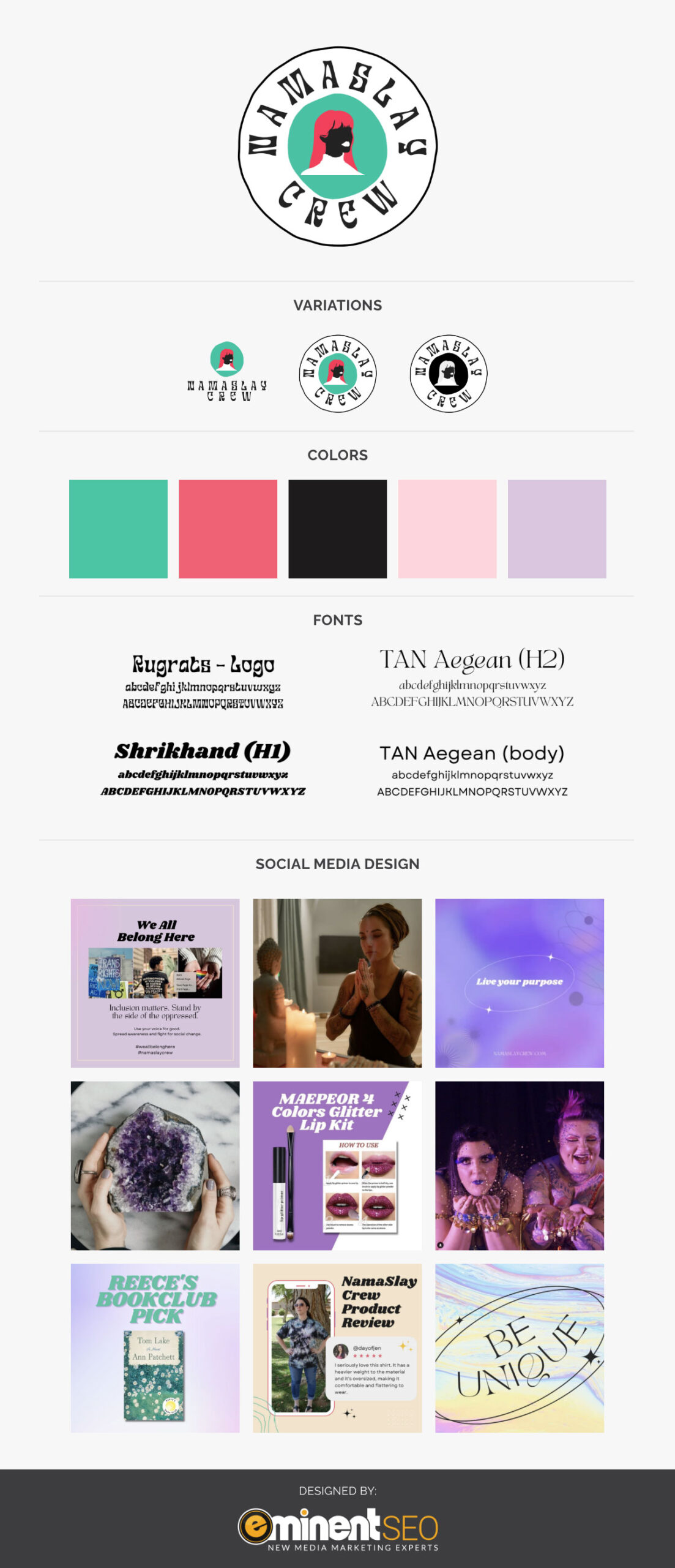
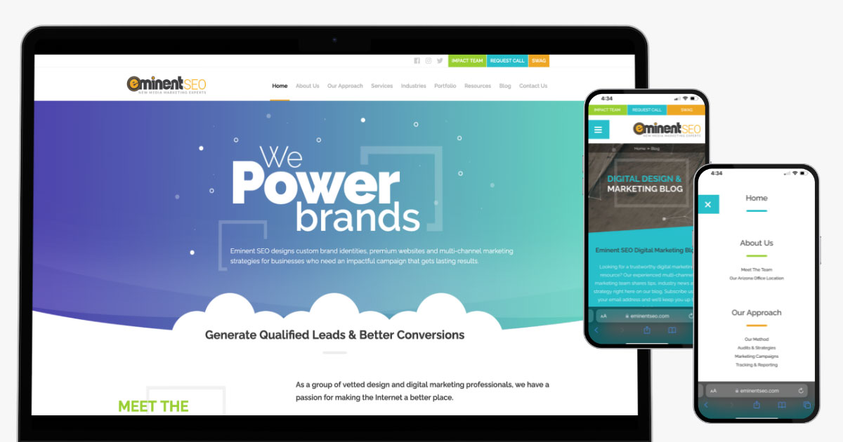
Effective and engaging websites will have striking visuals, remain easy to navigate for users, and are built with intention and careful planning. This is all to ensure that visitors to your website can easily get an idea of what services your business offers, discern what values are important to your business, learn how they can contact you, and make a conversion.
Whether you’re starting from scratch or refreshing your existing website, consider these essential elements of quality web design. We’ve provided additional insights below to boost your traffic and increase your performance.
Be Clear and Concise
Digging through unwanted or unnecessary information in search of the information they need is not an appealing prospect for most people searching the internet. They want to be able to find what they need as quickly as possible, whether they are looking for HVAC services, pet grooming, or anything else. No matter what type of business you have, the message and purpose of your business should be easily identified when a potential customer visits your website. You can achieve this by sharing simple, intentional information.
Outline Your Purpose
Your business is important to you, and it is likely that you have put a great deal of time, effort, and attention into making it successful. The design of your website can help contribute to that success when your business values and purpose are clearly outlined. This can be handled in a few different ways, but mission statements and about pages are two of the most effective.
Including a tagline or mission statement that clearly outlines the purpose of your business can help visitors understand what they will get if they work with you. Making this a prominent component of landing pages on your website will ensure that potential clients will see it, regardless of what page they visit.
Adding a well-developed About page on your website can also more clearly outline your purpose. This section can tell the story of how your business started, highlight those in leadership positions, and give visitors a glimpse into why your business was started. Using simple, straightforward writing is also an important aspect of sharing information on your website.
Include Copy That Is Easy to Scan
One of the best ways to make your website clear and concise is by making the information easy to digest. When potential clients visit your website, they are more likely to click away if they cannot get the information they are looking for quickly. Make sure that the copy on your website has clear, concise language and is easy to scan. Writing short paragraphs, using bulleted lists, and including headings and subheadings are all methods to create easily scannable copy.
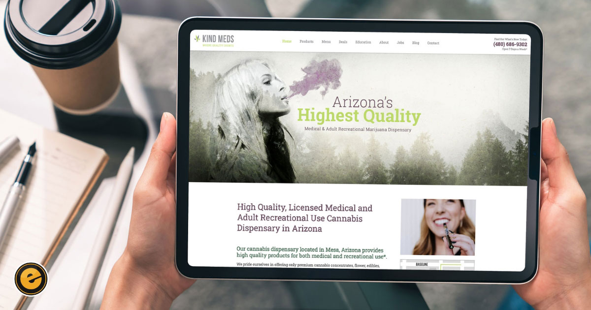
Kind Meds is a great example of a clear, concise website. They are a cannabis dispensary in Arizona that sells recreational and medicinal cannabis products. Their website homepage includes small paragraphs, simple language, and a clear statement of their purpose. Best of all, their brand’s purpose is clearly stated in small blurbs easily scannable by the human eye.
Make Your Site Easy to Navigate
Simple navigation is a major aspect of a successful website design. You want to ensure that visitors stay on your website once they arrive instead of feeling like they have to hunt for information, getting frustrated, and clicking away. If users are unable to navigate to the landing pages they need from your homepage, they will move on and find a different business to work with. Including a simple navigation structure and opportunities for interaction can help make your website easier to navigate.
Clean Page Layout
Creating a website that is clean and not visually cluttered can help make it easier for users to find the navigation options they need. This may include having a simple color palette, incorporating straight lines throughout each page, and having different sections of the website clearly defined. Clearly labeling each area of your website with headings and subheadings can also make navigation easier because potential clients can find what they are looking for quickly.
Simple Navigation Menu
One of the best assets you can have when creating a website that is easy to navigate is a simple, functional navigation menu. When all the information available on your website is in one place, it is more accessible to those who visit the site.
Some tips for creating a simple navigation menu include:
- Only include 5-10 options
- Use simple titles for each page
- Make sure the menu is consistent throughout every page
- Keep menu options on a clear background so they are easy to find
- Emphasize the page a user is on by underlining or bolding the menu page
Interactive Areas
When users are navigating your website, you can keep them engaged and give them quick access to information with interactive sections of your website. For example, if you sell a product, you may consider making the photos of each product interactive.
The product photo may be the primary image, but when a customer hovers over the photo, it will flip and provide more information about materials, sizing, and cost. For businesses that offer a service, there may be color blocks that name each service offered. When a visitor hovers over the block, it will reveal more information about the details of that service so that the information is more easily accessible.
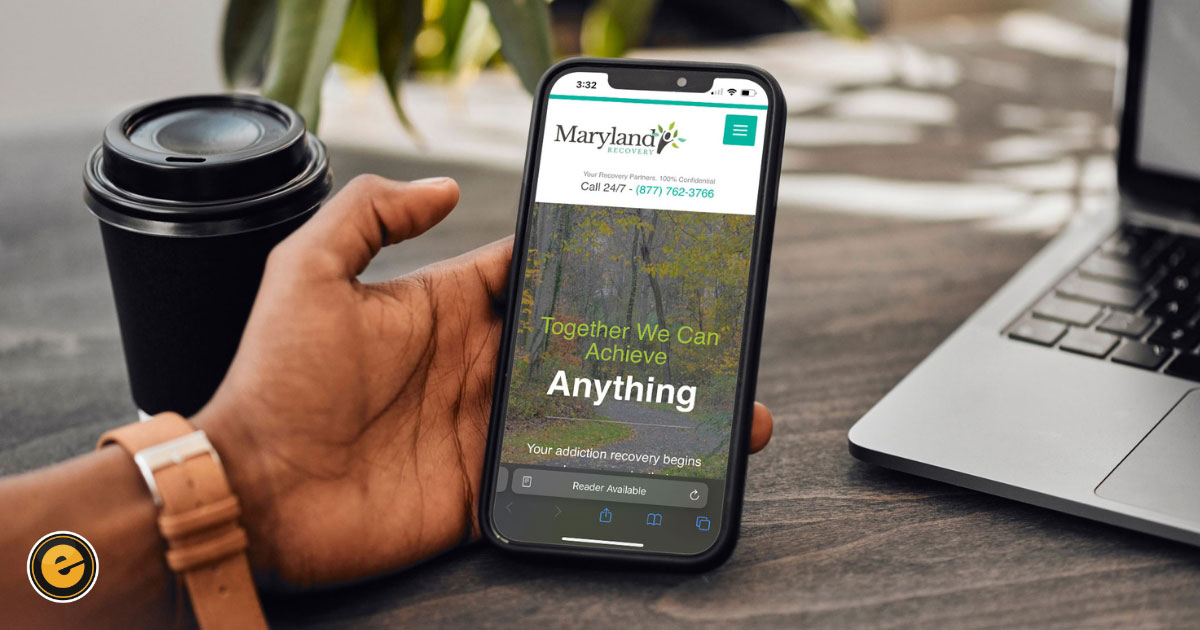
Maryland Recovery is an addiction recovery center located in Bel Air, MD, that provides multiple treatment options for patients recovering from drug and alcohol addiction. Their website is an example of one that is easy for users to navigate. The layout of each page is simple, cohesive, and uses straight lines to differentiate between information.
They also only include six options in their navigation menu, which is in the same location on each page. Their homepage also contains an interactive block where visitors can read reviews from previous patients about their experience. Overall, their website is well-designed and created for simple navigation.
Create a Mobile Friendly Site
It is more and more common for people to use their phones when they are searching for services or information online because they may be traveling, have minimal time available, or do not have access to a computer. Whatever the reason, more than half of all internet users will find your business through a mobile device. This means that it is essential to create a website that is mobile-friendly.
Responsive Web Design
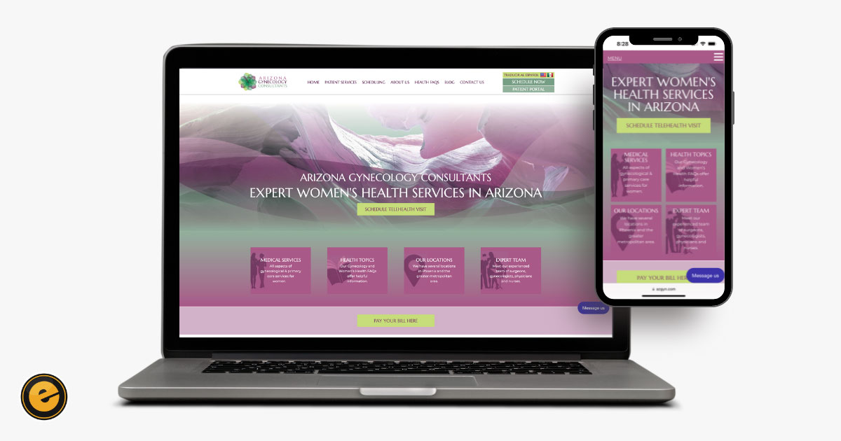
If you are not familiar with how websites are created, then it can be difficult to know where to start when it comes to making your website usable on mobile devices. Screens on mobile devices, like smartphones and tablets, are much smaller than a standard computer screen, so your website will need to be structured in a way that ensures it can be easily read and navigated on any device. The type of design that you will need to employ is called responsive design.
Responsive design uses a stacking method to guarantee that the different sections of a website can be read and navigated well when they are seen on a mobile device. Making sure that the design works for your website may take some trial and error.
Responsive design elements could move the location of things on your website, like text or images, so you will need to view the site on various mobile devices regularly throughout the design process to ensure the final product is cohesive and effective. At Eminent SEO, we provide website design services and ensure that your website is effective and engaging across every device, regardless of the content and purpose of your website.
Be Intentional About Visual Design
The content, purpose, and navigation tools are all essential parts of creating an engaging website, but the way your website looks can also play a key role in drawing in potential clients. For example, when someone is searching for medical services, and they find a website that looks outdated, is overly cluttered, or has bright, distracting colors, they may not trust that business to provide the care they need. By contrast, a sleek, modern website with soothing blues, greens, and whites may evoke more authority and trust. A website that uses intentional images, a cohesive color palette, and is visually striking is more likely to draw in potential clients.
The Psychology of Colors
Colors are an important part of any design, whether you are making a website or decorating a home. They can create a certain atmosphere, make a brand seem trustworthy and well put together, or be overwhelming and clash. Understanding the psychology behind various color choices can give you a clearer idea of how you want your website design to look.
Creating a Color Palette
Website users will likely notice the colors on your website before they read the information that you have available. The color palette that you build your branding around, including your website design, can have a major impact on users’ first impressions.
There are several types of color palettes that you can choose from.
Monochromatic Color Palettes
Monochromatic color palettes use three shades of the same color. This color palette is very simple and can be easily utilized in different projects like printed marketing materials and social media.
Triadic Color Palettes
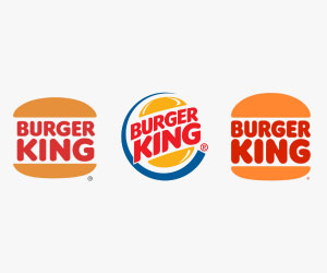
Triadic color palettes include three colors, most often chosen by placing an equilateral triangle on a color wheel. This is most effective when one of the three colors is the primary, and the others are used as accents. One familiar example of this color palette is the Burger King logo, which uses yellow, blue, and red. However, it’s interesting to note that they recently rebranded and went back to their original look and feel after 20 years of using the yellow, blue, and red version.
Tetradic Color Palettes
Tetradic color palettes are similar to triadic, but they incorporate four colors that are spaced equally around a 12-color wheel. Again, if you choose this type of color palette, it is often most effective to make one color the primary and then create accents with the other colors.
Analogous Color Palettes

Analogous color palettes are very simple and require you to choose three colors that sit side by side on a color wheel. Since the colors are close to one another on a color wheel, then they are likely to work well together in designs. The BP logo, which includes yellow, yellow-green, and green, utilizes an analogous color palette.
Complementary Color Palettes
Complementary color palettes utilize two main colors that are directly opposite of each on a color wheel. These combinations are very simple and popular, with some of the most common being the red and green of Christmas or the orange and blue of The Chicago Bears football team.
Emotions In Your Brand’s Colors
Another thing to consider when you are selecting a color palette for your brand and your website is how the colors may impact the emotions of visitors. Every color can evoke different emotions in the people who view them, like red being associated with passion or energy and yellow being considered innovative and joyful. Once you understand the psychology of colors, you can use that knowledge to ensure that your website has the feel that you want.
Images With a Purpose
The images you include on your website can either help or distract from your overall goal. For example, if you are creating a website to sell art that you create, then you want to be sure that the photos you include of each product are high quality.
This will make sure that people who visit your website have a clear idea of what you offer and will know what they are receiving if they purchase from you. By contrast, outsized, poor-quality, or irrelevant photos will only serve to distract from the message you want your page to send. Brandon Scott, a professional acrobat, includes high-quality photos of his performances on his website so potential clients can see his skills.
Make It Quick
Capturing and keeping the attention of visitors is essential to the success of your website. You may have utilized the most important elements of a website design when you were creating your site, but that does not matter if your site does not load quickly. In this era of high-speed internet, users expect nearly instant results, and a slow website will drive users away. In fact, over half of them will leave if your page takes longer than three seconds to load.
Some of the most effective ways to accomplish this are optimizing the size of your images, compressing files so they do not slow down the functionality of your site, and addressing your website’s coding to avoid unnecessary delays.
Contact Eminent SEO for Custom Branding and Website Design
Is your website snazzy, snappy, and user-friendly, or outdated, bloated, and difficult to navigate? Using these principles of good web design can drive traffic to your website, increase your engagement, and boost your conversions. Take a look at our Eminent SEO design portfolio for more ideas and demonstrations. And, contact us when you’re ready to discuss high quality website design services.
Resources :
- Bianchi, Tiago. “Global mobile traffic 2022.” Statista, 27 April 2023, https://www.statista.com/statistics/277125/share-of-website-traffic-coming-from-mobile-devices/
- Weatherall, Jenny. “Understanding Color Psychology in Web Design.” Eminent SEO, 21 July 2022, https://www.eminentseo.com/blog/color-psychology-web-design/

