In December, Pantone calls out its “color of the year,” dictating to many companies and consumers what the next 12 months will look like in trends and, hopefully, corresponding purchases. It’s a big deal to real estate and interior design businesses, textiles, apparel and accessories creators who want to make sure they garner appeal to their audiences and referring business partners. But there’s a methodology behind color choice. It’s multilayered and touches on where people are at in their hopes, dreams and current state of emotional flux. As such, this psychology of color in marketing isn’t only apparent at Pantone’s discretion but ongoing with every brand redesign and creative campaign. If you’re palette savvy, color will mean more to you than an afterthought. Done right, it’s the basis of shaping consumer behavior and responsiveness, both, on conscious and subconscious levels.
Color Is the Visual Personification of Emotion
In simplistic terms, think back on when you were a kid, spending time on a rainy afternoon with a box of crayons and a coloring book. No one said you had to use brown, black, gray, or tan for hair color when you filled in between the lines (okay maybe outside the lines too). Perhaps you stuck with convention on colorization or maybe you felt that blue, green, violet or chartreuse were appropriate choices for Goldilocks. But why? What was the reasoning behind color choice? It has much to do about what choice made you feel good or feel right about crafting the complete picture.
How we feel about a product or service, even prior to having a direct experience with it, can be initially carved from the visual brand itself, evident in a logo, product or its packaging, associated merchandising, and web design.
Let’s drill it down into a harsh human moment. Have you ever met someone and just didn’t like them? You may not have been able to put your finger on it but there it was… that feeling of nonalignment, discomfort and disinterest. Yeah… the psychology of color can show up like that too, affecting brand marketing on a grand scale. So how do you know what color is right for your brand? It’s not an exact science, not even close.
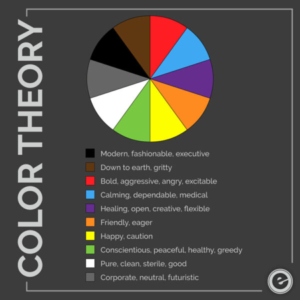
Color Wheel of Feelings
If you search for the meaning behind each color, there are a variety of answers available, it just depends on where you look and the preconceived notions you may already have about them. Though the color wheel provides answers, it is meant as an overview of what many people believe defines the feelings or emotions of these hues. But exercise some caution. Think of it similar to the game show, the Wheel of Fortune. You turn the wheel and it lands on a color. There is no rhyme or reason behind where the wheel stops turning. It’s somewhat the luck of the draw. The same can be said about brand color and how your target audience(s) responds. Are you feeling lucky?
Beyond luck (and knowing your target audience) you’d be wise to include psychological, spiritual, and cultural aspects of their thoughts and behaviors that could affect their perception of color.
Life Experiences and Associations Shape the Meaning We Give Color
Why do you like turquoise while your best friend swoons over carnation pink? There could be an association between the color and a positive memory you have surrounding it. This is sort of like a subconscious word association but with pictures. For me, when I envision the color midnight blue (my favorite) it reminds me of the sky and the water at night on the beach. It was peaceful, calm and a personal place to escape. Can you recall why you have your favorite color?
Spirituality Brings Color to Light
Aspects of religious teachings or spiritual thought can enter into colorization preferences. Many people who believe in Judeo-Christian faiths refer to white light as the means to ascend into heaven, while dark and eerie shadows represent pending death. In addition, those who believe in hell may describe it as a violent place, full of red-colored demons surrounded by bright orange fire.
For the metaphysically minded, color is often used to define a person’s aura. If you are told that you emanate a yellow aura, it means your energy is full of spiritual power and the ability to harness new ideas and creativity. But if you weren’t a spiritual person and didn’t view color in this way, seeing a brand symbol in yellow might be a subliminal sign of caution. If so, how likely would you be to trust this product or service?
Culture Holds the Key to the Tone that Color Sets
Depending on where you are in the world, the same color can mean something entirely different from region to region or culture to culture. For example, many Americans hold the color white to mean purity or goodness. However, in some countries in Asia, including China, Korea and Japan, white equates to misfortune, loss, mourning or death. Often worn at funerals in Eastern cultures of the world, white is the antithesis in North America as it signifies light and purity in Western society.
Regarding the color black in the U.S. and Canada, for example, its underworld connotation may bring discomfort to some but not to those who resonate with Goth or Gothic culture. People who consider themselves Goth follow certain color guidelines in their fashion. Often misunderstood by the general public, Goth individuals will don heavy contrasts in their clothing and makeup. Stark white faces, deep red or black lipstick, eye liner and clothing represents Goth culture but not as an obsession with death. Rather, the use of black apparel and accessories is more about emulating a dark or mysterious allure, while paying respect to Victorian and Elizabethan eras as well as punk couture.
How Business Gets Color All Wrong
Perplexed yet? While there are no guarantees that you’re going to get brand color choice right for everyone, it’s more about what you need to be doing to maximize the possibilities of appealing to as many people as possible. Here are some points of contention that could make the difference between a marketing win and a complete snafu.
Disconnected Brand Impression
There’s a hierarchy of linear thinking that plays an important role in brand color. It isn’t about choosing the right color but more about understanding the relationship between your product or service and how color should properly represent it. Men and women will favor certain colors over others differently and it’s rooted in how they perceive the meaning behind the color. If you take that into consideration when picking your palette, your brand color will more likely hit the mark.
To illustrate this concept, imagine a company entitled Green Machine. For the executive, the name could imply a money-making endeavor. For a horticulturist, the name eludes to landscaping. And for environmental enthusiasts, there’s an expectation that Green Machine supports ecological initiatives. If their brand color is only green, expectations of who the company is will not meet expectations of many because the color doesn’t make it clear.
Now, if the brand palette includes brown, this favors landscaping business. If green is partnered with blue, this aligns with environment. And if the green is interspersed with accents of black, there’s a more corporate or hard-edge feel, aligning with financial business.
The use of color in your brand should instantaneously equate to what your business provides, what it stands for, or ideally both. When your color represents your business authentically, you will more likely attract the people who would be interested in what you have to offer.
Personal Choice Rather than Audience Specific
Ego often gets in the way of selecting the colors that fit a business. It sends chills up and down my spine when ego takes front and center. I recall a client in Scottsdale who was starting a new marketing agency and needing to pick his brand colors. This new business was going to be the next best thing since sliced bread in the creative world, showcasing strong work by the best art directors, writers and videographers in town. The brand positioning was edgy, bold and confident. Think about the colors you would choose. I can already tell, your ideas are better than what the client decided on. You ready? He was adamant about navy blue and gray for his brand. (pause) I know, epic fail.
Miscommunicating Focal Points
Even if you’ve chosen your brand colors right to a tee, how you place them will strengthen your decision or dull it. Color, used effectively, can draw the right attention to where it needs to be: on a tagline, a product, or a pricing CTA. Effective use of color can serve as visual cues to a customer, leading them to where you want them to go on your website, and throughout the user experience.
Why Brand Messaging and Color Should Complement Vision
Whether you’re just a getting your business off the ground or considering a marketing refresh, color is a crucial piece of the success puzzle. In fact, make it part of your marketing plan to revisit its use each year. I’m not suggesting that you need to ditch what you already have, but maybe add another color to make the primary brand hue pop off the page. Or select a more subtle hue that brings the existing palette together better, defining your brand story more succinctly.
All in all, color is a personal preference. Though when a business utilizes the power it possesses through audience assessment and strategic execution across all media channels, color not only gives your company the attention it deserves but leads people to your door.
Rethink Your Color, Reevaluate Your Brand. Hit Us Up!


