Tag Archives: Development

Why You Shouldn’t Neglect to Optimize Your Website’s 404 Page

This entry was posted on by .

Neglecting To Optimize 404 Page - Eminent SEO

A 404 webpage is returned whenever a user mistypes a URL, follows an errant link, or lands on a page that has moved or been deleted.

This type of page is only returned in the event of an error, so there’s little point in putting effort into your website’s 404 offering, right? Won’t users just hit the back button if they see a 404 page, whether they were on your website immediately prior?

Well, the answers to those two questions are no and not necessarily.

Companies who take the time to fill out their website’s 404 page can demonstrate the three following characteristics:

  • Their personality
  • Their level of creativity
  • Attention to detail

Filling out your website’s 404 page signals to your existing and prospective customers that you’re thorough and that you care about your website’s user experience. There’s also some strategy involved in how you attempt to direct visitors from your 404 page. And ultimately, there’s SEO value in how you handle your 301 redirects and when the 404 page actually appears. If numbers like 404 and 301 don’t really ring a bell, learn about all of the HTTP response codes in this comprehensive list from Mozilla.

In this post, we’ll take a look at:

  • Why 404 pages appear
  • How to lay out your website’s 404 page
  • Some top examples of 404 pages across the internet
  • When to redirect 404s and when it’s OK to leave them be

Why 404 Errors Happen

Ideally, a user would never land on a 404 when trying to access any area or any file of your website. But it’s going to happen eventually. Your domain doesn’t cover every imaginable combination of letters, numbers and symbols past your .com (or whichever top-level domain extension you use), so 404s are bound to happen every once in a while, no matter how well you cover your bases with 301 redirects.

404 pages aren’t the end of the world. Someone either just flubbed a character or two in manually trying to reach a page on your site, or maybe another website or social media user tried to link to your site but errantly copied the URL. Anyone who tries to follow a faulty link will land on a 404 under your domain.

Thankfully, Google doesn’t penalize your site for returning a 404 page here or there. But if you have an inordinate amount of 404 errors on your hands, then you have a problem. Running a site-wide crawl and then 301 redirecting any broken links will fix that issue right up for you.

Besides deleting a page entirely or slightly tweaking an existing URL, 404s can also happen when you move your entire website to a new domain. You need to 301 redirect every single old URL to the equivalent version on the new site. Links to your old address will get broken if you don’t redirect them to the new domain. Think of it like forwarding your snail mail to a new address.

404 Page Optimization

While you don’t want the search engines to index your website’s 404 page, your objective here is to entice users toward another section of your site.

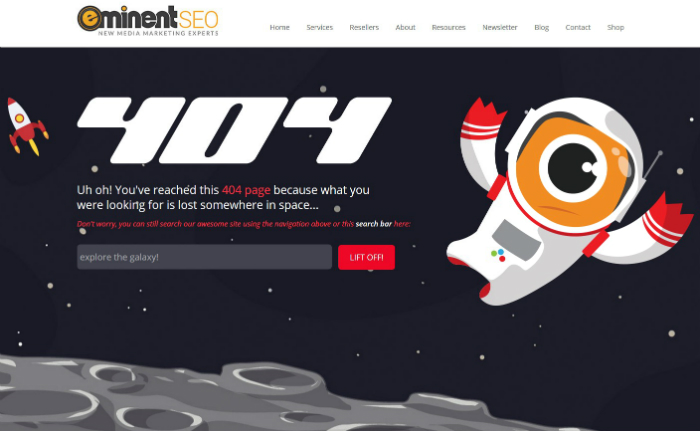
Besides some snappy graphics and language that makes it clear that there’s a problem with the URL, your 404 page should also maintain the same menu layout as the rest of your site. This includes an easily identifiable button (usually your logo) that takes the user to your homepage.

Here are those strategies in action, as seen on our 404 page:
Eminent SEO 404 Page Screenshot

Our error page also includes a search field so users can type in a term if they’ve deliberately landed on our website expecting to read about a certain topic.

Google itself has a few suggestions for creating 404 pages, including the idea of adding links to your most popular pages, blog posts, etc.

Adjusting URLs and Redirecting

And finally, when it comes to optimization, there are two steps you should take that don’t deal with the 404 on-page content itself, but instead concern URLs.

First, cover your bases by directing any logical misspellings of your site’s main URLs to the correct address. What this means is if you have a Services overview page, your URL will probably will look like “www.example.com/services/.” If somebody just types in “service” at the end of that string, you should have them redirected to your Services page, rather than returning a 404 for such an innocent mistake.

Another example is if your About page is structured as “www.example.com/about-us/,” make sure you have “www.example.com/about/” redirect to the correct URL. Take time to do this for every major page of your site, rather than leaving your 404 page as catch-all for common misspellings or variations of primary URLs.

Second, although your 404 page will show up for every errant URL related to your domain, make sure it actually shows up if a user searches for it directly, such as if they type in “www.example.com/404/.” You’d be surprised how many websites with even the best 404 pages have failed to get this right.

Speaking of the best 404 pages, let’s look at some shining examples across the web that may give you a little inspiration on how to flesh out your website’s error page.

Awesome 404 Page Examples

You can tell that many companies and individual website owners have fun with their 404 pages. As I mentioned earlier, it’s a chance to show off your creativity and even the personality of your business. It’s also just one more place where you can reiterate your brand strategy, as you can see in our 404 example above.

While no 404 page category has been created yet for either The Webby Awards or the American Advertising Awards (fka the ADDYs), there seems to be a healthy competition on the internet for who can serve up the greatest 404.

Beware that if you try to use copyrighted material on your 404 page, you may get sued or at least asked to remove the content in question. Two sites on this TIME “Web’s Best Error Pages” list from 2014 have found out the hard way, as you’ll no longer see images from “Dumb and Dumber” and “Jurassic Park” if you click on the links provided in the TIME article.

Here are some exemplary static and interactive 404 pages that you can find across the internet currently:

Stellar Static 404 Pages
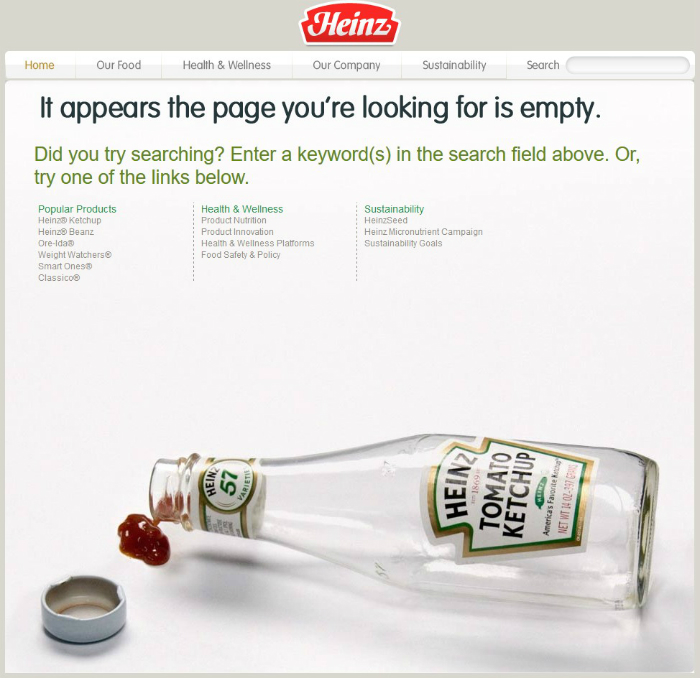
Heinz Error Page Ketchup BottleUniversally recognized ketchup-maker Heinz could probably use an update of its website, but its error page has been catching eyeballs for years, and is still top of the line. Not only does Heinz feature its iconic ketchup bottle in a metaphorical way, but the page is optimized in a manner that lets visitors easily navigate toward other parts of the overall site.


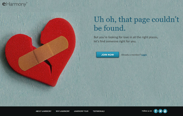
eHarmony 404 Page Screenshot
When you land on this page, it’s readily apparent which site it belongs to. The broken heart image easily ties into eHarmony’s overall brand. The page also gives you clear options on where to go next.


Mashable 404 Page Screenshot
Awesome. Mashable’s toe-ripping-through-a-sock image on its 404 page is unforgettable. A search field is also provided and the main navigation is right at the top. This media company certainly put much more effort into its 404 page than most other national news-related sites have cared to.


CSS-Tricks 404 Page Rip
CSS-Tricks is an online community for web developers, and its 404 page plays right into its audience. The only problem here is the page offers no links to the rest of the site, or anywhere else, for that matter. Great image, though. If you look at the meta title, it explains the concept of this 404 page: “You’ve ripped a hole in the fabric of the internet. Love, Chris from CSS-Tricks.”


Impressive Interactive and Non-Static Pages

Blue Daniel 404 Page Screenshot
There’s a lot to see but not a lot to do on BlueDaniel.com, home of Daniel Karcher Film Design Studios. The homepage is just one full-browser video with audio and no clickable buttons or text. The 404 page, however, is as great as any you’ll find. It takes place in a subway station and has a moving passenger train. The motion image features posters for the TV series “LOST” and film “The Missing,” and a subway sign that reads, “Please proceed to the main level.”


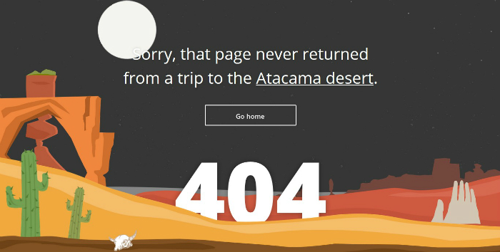
Tripomatic Desert 404 Page Screenshot
Online itinerary maker Tripomatic can also make a case for best 404 page on the web. This page features a full-browser scene of a sun and moon setting over a desert landscape. The scene goes from dawn to twilight to dusk, and it loops endlessly. The website’s navigation is not featured, but there is a large button to go to the homepage.


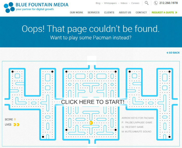
Blue Fountain Media Pacman 404
Can’t find a page on BlueFountainMedia.com (a digital marketing agency)? No problem. Just play “Pacman” instead, as featured on the website’s popular error page. The average time on page must be insane for this creative offering.


Hot Dot 404 Page Screenshot
Hot Dot Productions, a digital artistry firm, offers an error page that features a large “404” made out of tiny, pulsating dots. The page interacts with your browser as well, changing your vantage point of the manic dots.


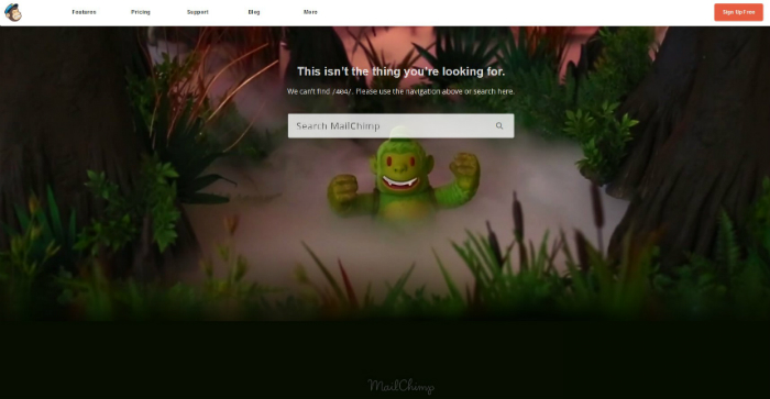
MailChimp 404 Page Screenshot
Email service provider MailChimp serves up a 404 page that features its recognizable mascot in an eerie forest setting. Fog slowly creeps across the frame, adding to the uneasiness. If this scene creeps you out too much, you can easily access MailChimp’s navigation at the top or search the site using the field right above the green-looking monkey.


Tinsanity 404 Page Screenshot
This error page is currently the best thing about Tinsanity.net, which has no content at the moment and a homepage that only links to two other sites. This 404 page features a panicked cup-and-straw beverage that skips frantically across the screen. There’s also some (very loud) audio to go with it.


When to Redirect 404s

Some websites are coded in a way that any time a visitor prompts a 404 error code, he or she is redirected to the homepage. This is known as a global 404 redirect. Although this seems like a viable way to keep visitors on your site when a 404 is served, it actually frustrates many users. They might think it’s a glitch, or because they came to your website looking for specific information, showing your homepage instead does nothing for them.

Instead of employing a global redirect, just take the time to spruce up your 404 page and run a site crawl to help you mitigate how many times users are receiving this error code. If some of the 404s keep coming from in house (meaning you have a navigational or other internal link that is broken), make sure you fix the error right away.

But What if I Have Backlinks to a 404 Page?

A backlink audit will tell you if other websites are still linking to a deleted or moved page within your domain. For a refresher on backlinks and to see which tools you can use to run this type of audit, click here.

If any external sites are linking to what is now a 404 page on yours, you should be choosy about which links you want to keep. If the page has simply been moved, you can 301 redirect the broken link to the new address, but it’s actually better to contact someone affiliated with the site linking to you and provide them with the new URL for the link. Links that pass through a 301 in order to reach their destination lose a little bit of power in Google’s eyes.

The above tactic should only apply if it’s a link you want to keep. If a low-quality site is linking to what is now a 404 page on your site, it’s actually not detrimental to your SEO to let the link stay as is. Backlinks from highly authoritative sites are the ones you want to uphold. Low-quality inbound links that produce a 404 error can remain in limbo.

If you’ve deleted a page that still has a link you’d like to keep, try to find the most relevant content on your site to redirect it to, or you may even want to create a new page that features the information that inspired the link in the first place. From there, you’ll either 301 redirect the link to the new page you’ve created, or you’ll reach out to the webmaster of the other site to give them the URL for your new content.

Have Fun with It

Spend some time and have a little fun with fleshing out your 404 page. Granted, you don’t want your site to return a 404 response too often, but it’s not catastrophic to have it show up once in a while. Plus, some users might get a kick out of how much creativity you put into it.

If you’d like a custom 404 page built for your website or if you need help with redirecting 404s and seeing how often they’re showing up for your visitors, contact the digital marketing and design experts at Eminent SEO today by calling 800.871.4130.
Avatar for Team Eminent SEO

Team Eminent SEO

Eminent SEO provides strategic SEO campaigns with measurable results along with expert website design, development, pay per click, content and social media and organic website marketing. 800.871.4130.

More Posts - Website

Follow Me:

This entry was posted in Content & Blogging and tagged , .

How Easy Website Builders like Wix, Muse and Weebly Hurt Your SEO and Growth Efforts

This entry was posted on by .

Easy Website Builders - Eminent SEO

Websites today are getting easier and easier for the average user to create.

You don’t even have to be a programmer or web developer to see a website come to fruition. Some website-building services don’t even require you to know a lick of code in order to launch a new site. You can just pick a design template, drag and drop content, write a little copy, and then it’s up and live in a matter of minutes.

Because of the low level of technical skill, you’d think such a site would look pretty basic. However, some of these properties actually look pretty good on the surface, boasting modern layouts and large, high-quality images. And that’s a good portion of the battle right there when it comes to having a successful web presence.

While it’s nice to be able to put up a presentable site quickly for your customers or just anyone following you closely, these types of websites struggle with long-term growth. Such a shortcut can only get you so far.

When it comes to complying with the latest SEO developments, most easy website builders get left behind – or at best take months or years to catch up. Let’s take a look at why codeless website builders like Wix, Muse, Weebly and similar services aren’t built to help businesses scale.

How Easy Website Builders Struggle with SEO

If you’re using your website to try to reach new markets and build your clientele, using a codeless website builder is going to make that task difficult for you. This is because it’s going to be a battle to get (and keep) any page from your website to show up on the first page of search results.

Even though these easy website builders allow you to type in your own meta tags for each page, and they offer proprietary SEO-related plugins, they still fall short in many ways when it comes to helping your rank higher in search.

Here’s why:

Poor URL Categorization and Structure

When you’re organizing the navigation of your website, it’s best to keep the URLs of your main categories and sub-categories clean and succinct. The homepage and the main menu items are all considered Tier 1 pages. If you have any categories that have drop-down options beneath, those are Tier 2 pages.

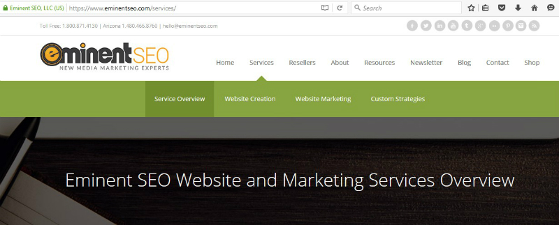
In short, it’s best to not have any Tier 2, 3, etc. pages branching right off the homepage, URL-wise. For examples, for our site you will see the URL of our Services pages as https://www.eminentseo.com/services/. We then have three Tier 2 options (not counting Service Overview) that stem from our Services page (and even some Tier 3 pages not shown in the main navigation).

Eminent SEO Services Page

If you visit our Website Creation page, you’ll see this URL:

Eminent SEO Website Creation URL

It’s very important to have the main page of the “silo” in the URL before “website-creation/.” Otherwise, everything just looks like it branches off from the homepage, and Google’s web crawlers will have trouble understanding how your site flows and which pages deserve more emphasis than others.

With a Wix-created website, any page other than the homepage starts with a “#!” (sometimes referred to as a hashbang) right after the main address. Not only does this make for a messy URL, but it looks to Google like every page is just a direct extension of the homepage. Thus, it’s going to be hard for the website to rank for any of its Tier 2 or 3 pages – unless you search for the site name and specific service directly.

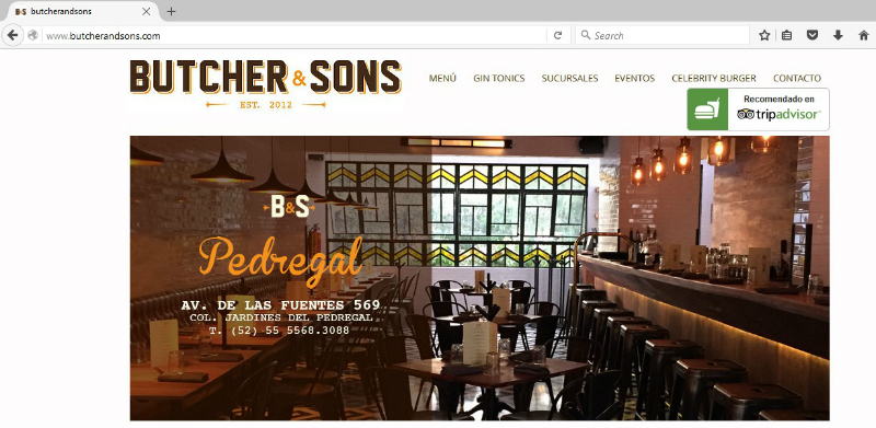
For example, we’ll look at one of the featured Wix sites: Butcher & Sons, a restaurant chain in Mexico.

Butcher And Sons Homepage

This site has a main menu category called “Sucursales,” which basically means “branches” or “locations” in English. The URL for the Sucursales page is:

Butcher And Sons Sucursales URL

And if you click on any of the six drop-down items under the Sucursales category, the URL will be structured as such:

Butcher And Sons Polanco URL

Notice how the top-level category, Sucursales, is disregarded when it comes to these Tier 2 pages.

Not good. And that’s no fault of Butcher & Sons.

With Tier 2 items branching right off the homepage, it’s like telling Google that all Tier 1 and 2 content is equally valuable. And for most websites, this is not the case.

As for Weebly and Adobe Muse websites, they don’t suffer from having hashbangs show up in their addresses, although many sites contain URLs ending in “.html” for their non-homepage content. This isn’t necessarily an SEO-killer, but it makes the URL longer and less eye-appealing. The best practice is to end your URLs like such: “services/.” Yes, ending with a forward slash is ideal.

Weebly sites appear to not be able to structure URLs optimally either. Tier 2 pages all seem to stem right off the home address. As for Muse, I had trouble going through its “Site of the Day” list and finding any website that even had Tier 2 pages visible from the main menu. Many of them had a menu that just directed to an anchored section of the homepage below the fold. In fact, I only found 2 out of the first 16 featured sites that had navigation that went deeper than the first tier. And when I did find such a site, all Tier 2 pages, you guessed it, branched right off from the home address. Tsk tsk.

Excessive Code

With the rise of codeless website platforms, many web developers noticed that excessive code was needed in order to make creating a website easier, particularly in Muse. In other words, lines and lines of code were used to offset the user’s lack of HTML knowledge.

Codeless website creators will have a hard time getting their content pages to rank well because search engine crawlers often have difficulty sifting through all of the extra code and figuring out what each page is about.

Excessive code also can lead to slow loading times, especially in the ever-growing world of mobile search. It should be noted that a site with slow loading times will prompt many visitors will bounce rather than wait for the entire page to load. Both slow loading times and high bounce rates cause rankings to suffer in Google Search, and people who use codeless website builders should be aware of these potential risks.

SSL Certificate Difficulty

If you’d like to upgrade the security of your website, obtaining an SSL certificate can be problematic with Weebly and impossible with Wix. SSL certificates create trust with your visitors and customers, and they’re projected to become a ranking factor in Google Search in the near future.

More on SSL certificates here.

With a Wix-created website, you actually don’t own your own content. They do. And since they basically own your website, you can’t add an SSL certificate whatsoever.

If you decide to add Wix’s shopping cart to your website, that will be SSL-protected, but otherwise, you’re out of luck with adding a site-wide security certificate. I’ll further explain the pitfalls of not being the sole proprietor of your website in a moment.

Weebly and Muse both allow you to add an SSL certificate to your domain, with some stipulations.

  • Weebly highly encourages you to purchase your SSL certificate through them. However, what they offer isn’t among the strongest types of such certificates on the market.
  • For an SSL certificate on a Muse-created site, you’ll have to go through your website host and a third party.

From looking through the featured websites on Weebly and Muse, it’s noticeable that most site owners aren’t utilizing an SSL certificate. Perhaps quite a few in the bunch don’t even know what an SSL certificate is – speculation of course.

You’re Not in Full Control of Your Content and Website

With Wix, you’re actually not in sole control of your own website. It may appear that way, but that’s all smoke and mirrors. While Wix’s Terms of Use says that you own all rights to any content you upload to your site, there’s this stipulation:

Wix Terms Of Use Ownership

This means Wix can modify the content on your site, remove it, or even feature or reuse it elsewhere. Your entire site could even be included on the platform’s featured websites page. But what if you don’t want to shout to the world that you’re using the Wix platform?

Wix Example Websites - ESEO

Other codeless website builders don’t infringe on your submitted content as deeply as Wix does, but they still retain to right to move or delete your material, especially if it’s copyright-protected, indecent or spammy. These platforms make it clear that you’re on your own if material you upload gets you into legal trouble.

Also, if you try to move your codeless-created website over to another content management system, it’s going to be difficult, if not impossible. With Wix, you can pretty much just copy and paste what you have, but you can’t download a page into a file that can be uploaded elsewhere.

As far as all Wix, Weebly and similar codeless website builders go, don’t even think about taking any of their graphics, templates, proprietary stock images, etc. over to another site. Only your original content can be taken and reused if you decide to create a website elsewhere.

The Times When Codeless Website Builders Can Work

Looking over the featured websites on Wix, Weebly and Muse, I see a lot of small restaurants, web design agencies, architecture firms and individual actors, pastors, public speakers, local bands and the like. Basically, these sites are like a slightly bigger about.me page.

You can think of a codeless-created website like a starter home. It’s affordable, it’s manageable, it works for the time being, and it allows you to get a sense of what you like and don’t like before you upgrade your space down the road. It’s also better than not having any site at all when it comes to handing out business cards or imploring your social media followers to visit your personal online space.

Like I mentioned earlier, many of the sites created this way actually look pretty good, as they are heavy on the visuals. Most codeless website builders even support shopping cart integration, so you can get a small ecommerce business off the ground. Overall, these types of sites are decent if you’re a one-person business or a startup with no coding experience and a tight budget.

Other popular easy website builders that require little to no coding include:

  • SiteBuilder.com
  • WebsiteBuilder.com
  • Web.com
  • Webs.com
  • Sitey.com
  • Sitelio.com
  • eHost.com
  • Squarespace.com

But You Want to Grow, Don’t You?

If you want to use your website as a means to help your business grow, relying on a codeless-built site is going to make that mission difficult. This is because an SEO strategy is hard to execute with these platforms. You saw that not only does Wix produce messy URLs, but Weebly and Muse both struggle with proper URL structure. That’s just one of many drawbacks.

Although Wix had the most minuses in the SEO analysis above, a common theme among all easy website builders is they seem to lag behind when it comes to Google’s changing standards, such as algorithm updates and ranking factors.

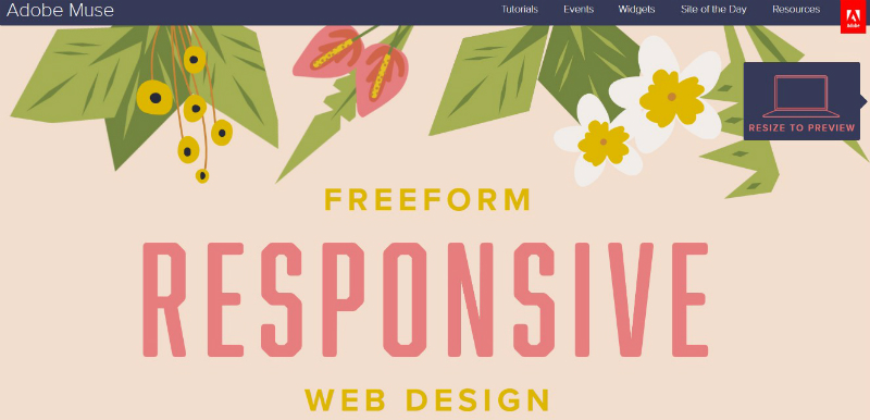
For example, Wix and Weebly didn’t jump into the responsive design game until somewhere between late 2014 and early 2015. Adobe Muse’s homepage didn’t tout the platform’s responsive capabilities until late 2015, and it still advertises this feature like it’s a new thing.

Adobe Muse Homepage Responsive Design

Your best bet at long-term growth is to find a digital marketing company that can not only create and host your website, but also implement a sound SEO strategy so your content ranks high in the search results. Eminent SEO has a team that excels in these and related strategies in order to help clients large and small succeed with their online presence. Click to learn more about our Website Creation services, or call 800.871.4130 today.

Avatar for Team Eminent SEO

Team Eminent SEO

Eminent SEO provides strategic SEO campaigns with measurable results along with expert website design, development, pay per click, content and social media and organic website marketing. 800.871.4130.

More Posts - Website

Follow Me:

This entry was posted in Design & UX Optimization, Search Engine Optimization and tagged .

To App or Not to App: Should You Put More Resources into a Mobile Site or Mobile App?

This entry was posted on by .

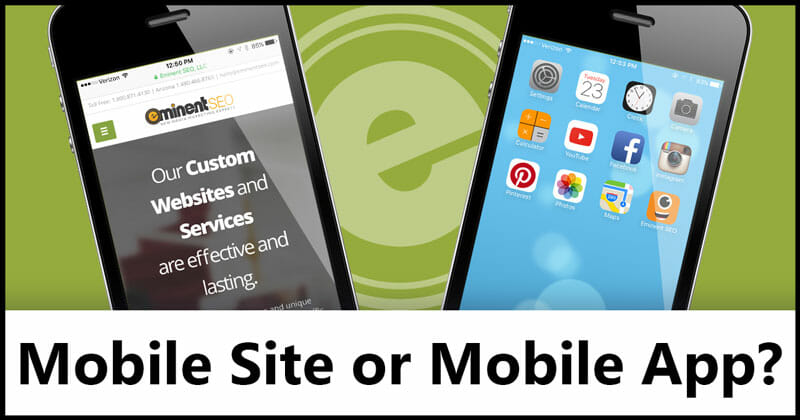
Mobile Site Or Mobile App - Eminent SEO

“There’s an app for that.”

There’s an app for almost anything now. And this might be a problem.

If your business is ready to ramp up its online and mobile marketing, it may be enticing to jump into the app game. But, before you do that, let’s temper that excitement a bit and take a hard look at exactly the market you’d be getting into.

Smartphone usage continues to climb, but the app craze of the early 2010s appears to have died down to an extent. That’s not to say smartphone users aren’t still loading up their hard drives with apps and that some businesses aren’t excelling on the app front, but your company should be cautious before making the leap into the marketplace.

An alternative to entering the app field is to upgrade your existing website’s mobile experience. In a recent blog post, we explained the rationale and logistics of making a website mobile-friendly. Now, we’ll look at what’s worth more of your time and resources in 2016: a mobile app or your mobile site?

The Mobile Web Landscape

Mobile traffic and search queries began overtaking their desktop counterparts in 2014. It’s worth noting that desktop traffic continuously grew from 1990 to about 2010 and has since leveled off, although it remains consistent.

So, while internet usage via desktop has remained steady over the last few years, mobile web traffic is on a meteoric rise. When comparing mobile web browser traffic to app traffic, mobile websites are seeing more than 2 times the number of unique visitors, according to a 2015 Morgan Stanley report.

However, loyalties to mobile websites aren’t as strong as they are for apps, and that’s both a good and a bad thing for the mobile internet. Smartphone users spend a great amount of time in their apps – 87 percent of their total time on a smartphone, to be exact, according to a 2015 comScore report. This means individual sessions in an app are usually much, much longer than they are on a specific mobile website.

The Mobile App Landscape

Phone Apps - Eminent SEOAlthough mobile apps comprise most of the time we spend on our smartphones, a majority of users aren’t just seeking out the latest and freshest apps to download. Here are some sobering facts to keep in mind as you consider jumping into the app market:
  • Separate reports from Forrester Research and Nielsen over the last couple of years have found that while smartphone owners use an average of about 25 different apps each month, only their top five apps (which differs by person) are getting a lot of love – more than 80 percent of a user’s total time in any app, in fact.
  • As of late 2014, according to Forrester Research, users spent a disproportionately high amount of time in the five following apps: Facebook, YouTube, Maps, Pandora and Gmail. You may have noticed that Google owns three of those properties.
  • The app market is only seeing serious download activity from the top 7 percent of all smartphone owners who download and use apps. This small demographic of serial app downloaders is actually responsible for 50 percent of all download activities.
  • A strong majority (65.5 percent) of smartphone users don’t download a single app over the course of a month, according to a 2014 comScore report. Of those who do make a download within a month’s time, most are only adding 1-3 apps in that span.
  • According to Forrester, social media and communication (WhatsApp, etc.) apps consume 21 percent of all smartphone minutes, not counting phone calls and text messaging. Gaming, streaming video, news, weather, music and sports apps also take up large chunks of smartphone owners’ time.
  • Apps tend to keep much of their traffic contained. This means that smartphone users are generally more hesitant to click a link and leave an app than they would be when on a mobile site, or even the desktop version of a site.

Analyzing Mobile Apps vs. The Mobile Web

You may have seen that apps beat the mobile web by a landslide when it comes to what takes up a user’s time on a smartphone. However, you also learned that mobile websites see much more traffic as a whole than apps do.

There is a quasi-monopoly on the app market. Google and Facebook mobile programs are dominating the competition. Other apps have found success, but they don’t account for nearly the amount of usage that Google and Facebook properties do.

On the other hand, the mobile web seems to be fostering healthier competition. Mobile web users appear to spread their attention over a wider range of properties, and they’re more likely to find a site they’ve never visited before.

Mobile web looks like the clear winner here going forward, but before we discuss how you can get a leg up on the competition with your mobile website, let’s look at a couple of cases where an app might still be worth your time.

Where a Mobile App Would Make Sense

If you run a small local business or a B2B type of company, putting your money and time into an app this year will likely be a waste of resources.

However, for certain businesses, a mobile app could be a great way to extend the experience for someone who has interacted with the company before. This means that the individual has walked into your store or is well acquainted with your website.

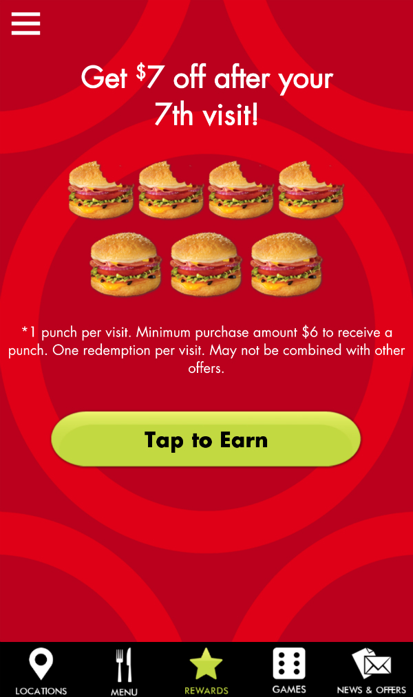
A mobile app could enhance the experience a customer has already had with your business. For example, many sandwich and coffee shops have moved from punch cards to an online app when tracking customers’ visits. It’s a sensible upgrade, and very helpful to the customer, when done right.

Schlotzsky’s Lotz4Me app records how many sandwiches you have eaten until you’ve earned a free one, and you can use the app to see the sandwich chain’s menu and all locations.

Schlotzskys Lotz4Me - Eminent SEO

The app also features company news and offers, some of which can get pushed to alert your phone. Mobile websites lack the latter capability. As you might imagine, some of the information from the company’s website (locations, menu and even news) has been repurposed to fit in the app, but it all helps build a better experience than simply seeing how close you are to a free sandwich.

Apps such as these are a logical extension of a business’s normal offerings, whether they usually take place online or face-to-face. A supplemental asset like this helps lead to more purchases down the road, while also building more loyalty to and appreciation of the specific company.

The national sandwich chain example might not be the best one if you own a restaurant or other type of local business with only one physical location. Asking your customers to download an app when you only have one locale might be a stretch, but perhaps you now have a few ideas on what makes for an effective app for the average business.

SaaS Success

It’s worth mentioning that software as a service (SaaS) companies can excel on the app platform, too. If they can get their product in an app form to work as well as their desktop version, then it’s a win for them and their customers. Even so, you’ll notice that this situation still only applies to users who have had prior experience with the company behind the app.

Apps aren’t generally a great way for an existing brand to grow its audience. Users either download your app because they’ve done business with you in some other setting, or they just never even find out or care about your app. The average smartphone user isn’t scrolling through Google Play or the App Store just looking for another app to download. Many have phone storage limitations to worry about, anyway.

If you do go the app route, you may not put up Facebook- or Google-like numbers, but you can still find success on the platform if you’re able to create a worthwhile experience – one that differs from your website – for your existing customer base.

Making Your Mobile Site Competitive

Eminent SEO Mobile ScreenshotCreating a mobile app only works in specific circumstances, so if those conditions don’t apply to your business, take the resources you were going to put into an app this year and direct them toward your website.
This starts with infusing your website with responsive design. How to test your site’s responsiveness and how to get started on making it mobile-friendly were previously covered in one of our recent blog posts. See here.

Having a mobile-friendly site helps with search engine rankings, and it helps you better compete on the mobile web, where many big opportunities await. From there, it’s all about employing the best SEO practices and keeping your site replenished with plenty of appetizing, worthwhile content.

Instead of spending time having a developer create an app, go back and evaluate how your site looks and functions on various screen sizes. What needs to be present? What can be condensed or hidden? Your content team should get together with your developer and make sure your site is providing the best possible user experience on devices of all sizes.

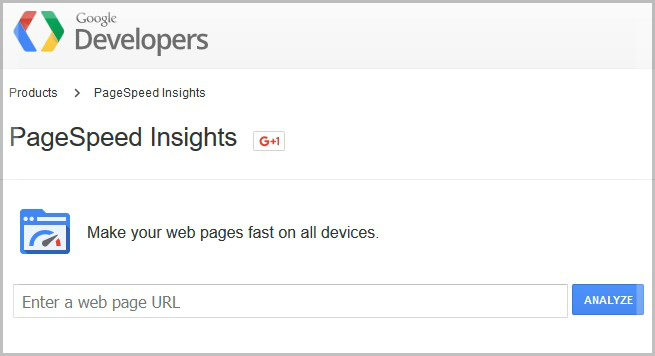
And finally, your site’s pages need to load fast. Even a 2-second delay can make all the difference between a bounce from your site and a conversion. Google’s PageSpeed Insights will let you know if any pages on your site load slowly and what you can do to speed them up.

Google PageSpeed Insights - ESEO

Speeding Up Your Website

Here are some quick steps you can take to get your website running more smoothly and quickly, especially on mobile devices:

  • Reduce scripts and move them to the bottom of the page.
  • Mitigate the number of plugins your site utilizes. Deactivate and delete any plugins you no longer need.
  • Compress entire pages with tools like Gzip.
  • Enable browser caching, which benefits return visitors.
  • Crop your images to the exact size they’ll be displayed in a desktop browser. Remove any image comments in the file. Reduce the color depth of all images to 150 dpi or lower. Never use BMP or TIFF files.
  • Make sure you don’t have pages using more than one external CSS style sheet. To see if you have more than one external style sheet on any given page, use this tool.
  • If you have any elements that load slowly but are must-haves, consider moving them well below the fold, so at least the top of the page loads quickly.

Conclusion

Although Google has begun indexing content from mobile apps  meaning it can show up in the search results, mobile web still appears to be the clear winner when it comes to where you should invest your marketing dollars in 2016. It behooves you to put your focus into competing on the mobile SERPs (search engine results pages) rather than in the App Store or Google Play.

If users aren’t as loyal to individual websites as they are to their top five apps, that means there’s a good chance they’ll eventually turn their attention to your site and see what you have to offer them. You’ll have a better chance on that front than you will with trying to woo new customers in the app marketplace.

There are some instances where an app makes sense, as mentioned earlier, but in most cases, mobile web appears to be the way to go.

To get help from a team that can make your website mobile-friendly and more competitive in the world of mobile search, talk to the Eminent SEO team. Just call 800.871.4130.

Avatar for Team Eminent SEO

Team Eminent SEO

Eminent SEO provides strategic SEO campaigns with measurable results along with expert website design, development, pay per click, content and social media and organic website marketing. 800.871.4130.

More Posts - Website

Follow Me:

This entry was posted in Marketing Strategy and tagged , .

What is an SSL Certificate and Why Should Your Website Make the Upgrade?

This entry was posted on by .

What Is An SSL Certificate - Eminent SEO

Going off our last post on responsive design, another area where you should try to upgrade your website in 2016 is security.

Just as you likely enjoy logging into certain websites and knowing that your information and passwords are kept secure, so should you try to foster the same experience for each of your online visitors. Especially if your website has a shopping cart, you need to make sure that the sensitive information your customers enter doesn’t fall into the wrong hands.

Not only could you lose visitors by not having a secure site (even if they only log in to post comments), but many SEO-related ramifications are latent for websites that have yet to upgrade their security.

In this comprehensive blog post, we take a closer look at:

  • What exactly is an SSL certificate
  • The different kinds of security certificates
  • The rationale behind upgrading your site’s security
  • How you can approach the upgrade process

SSL Certificate Definition and its Usefulness

SSL stands for “secure socket(s) layer.” It’s a type of technology that establishes a secure connection between a user’s browser and the hosting server of the website he or she is visiting, so long as the website has a valid SSL certificate. The certificate is made up of a digital computer file or small piece of code. Generally, SSL certificates are only valid for one domain (web address) and corresponding server at a time.

When someone is visiting an SSL-certified website, they are essentially handed their own personal key to unscramble the content of the site and view it normally for the entirety of their desired session. All communication between the user and the website (or the hosting server, more specifically) during this time is encrypted, meaning hackers can’t spy on the user’s session, insert malware and steal personal information.

Besides individual websites, SSL is also valuable for sending and receiving secure email, files, instant messages and other forms of sensitive information.

How to Look for an SSL Certificate

To see if a certain website has an SSL certificate, open up the site and look to the left-hand side of the address bar. Look for a padlock icon and possibly some other information that precedes the actual URL of the site.

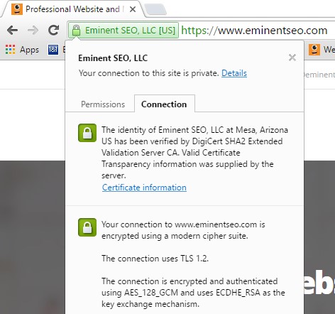
Take our site, for example. Your browser should show you the padlock icon and our full company name before the URL. Below is what it looks like in the Firefox browser. The way Chrome displays it is not much different.

Eminent SEO SSL Certificate Icon


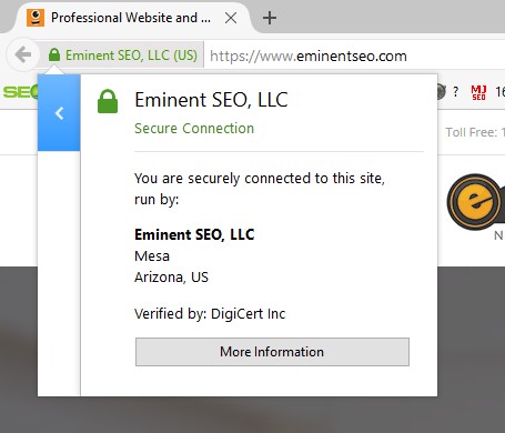
If you actually click in that area, you will be given even more information about the company that operates the website as well as the third-party Certificate Authority (CA) that verified and approved the site’s security.

Eminent SEO SSL Certificate Details


Here’s how that information is shown in Chrome:

Eminent SEO SSL Certificate Chrome Details


On some websites, you may only see the padlock icon to denote an SSL certificate. This icon is still clickable and can show you the issuing certificate authority. Take one of our favorite websites for SEO-related news and advice, Moz, for example.

Moz SSL Certificate Icon


There’s a reason the business’s name doesn’t show up in the address bar ahead of the URL. I’ll get to that phenomenon later.

Another attribute to look for in a secure website is an “s” in the protocol of the URL. In other words, look for “https” instead of the previous standard of “http.” You’re probably seeing dozens, if not hundreds, of sites slightly updating their addresses in this manner. All the HTTPS stands for is “secure hypertext transfer protocol.”

You also might see HTTPS called one of the following:

  • HTTP over TLS
  • HTTP over SSL
  • HTTP Secure

What is Transport Layer Security (TLS)?

SSL has actually long been phased out by a similar technology called transport layer security (TLS). However, it’s still common for techies and certificate authorities to say SSL when referring to either technology. For some reason, the term “TLS certificate” never really caught on.

Both SSL and TLS are also known as cryptographic protocols. If you’re wondering, the internet is now actually up to TLS 1.2, while version 1.3 is supposedly in the works.

Different Types, Strengths of SSL Certificates

Not all SSL certificates are created equal. Some companies can even sign their own SSL certificate, although this isn’t the recommended route. Below is an overview of some of the most common SSL certificates on the market:

  • Self-signed certificate: A basic certificate generated for internal purposes and not issued by a certificate authority. This type of certificate obviously isn’t fully authenticated nor as strong as an SSL certificate issued by a CA.
  • Domain validated certificate: A quick verification check is performed to ensure the applicant owns the domain for which he or she wants an SSL certificate. The applicant can get away with not even being a valid business entity, however, which is why this kind is considered an entry level SSL certificate.
  • Fully authenticated SSL certificate: The business needs to pass a number of validation procedures and checks to receive this type of certificate for a domain. These certificates take longer to obtain, but they denote a stronger level of online security.
  • Wildcard certificate: For websites with several subdomains, a wildcard certificate is a sensible option to secure the entire collection. For example, Yahoo’s subdomains show up as sports.yahoo.com, news.yahoo.com, etc. Yahoo is secure domain, and may very well be utilizing a wildcard certificate.
  • SAN (subject alternate name) certificate: This kind of certificate is similar to a wildcard one, but it allows more than one domain to be included in a single SSL certificate. This type works for websites with one or more microsites, but it takes time for each domain to be verified and authenticated before a CA issues the certificate.
  • Extended validation (EV) SSL certificates: Websites with this type of certificate have met the highest standards for authentication. The address bar turns green in most browsers when a user visits an EV SSL-certified website. The true owner of the domain and its country of origin will be displayed in green in the address bar. For reference, check out our site, which recently received its EV SSL certification.

The SEO Value of SSL Certificates

Google is continually making moves to make the web a more secure place. And, by golly, what Google wants, Google usually gets.

HTTPS Pages First

In 2014, websites and individual web pages an HTTPS prefix began to get a leg up in the search engine rankings. Near the end of 2015, Google announced through its Webmaster Central Blog that it will start to index the HTTPS version of web pages first, as we wrote about in our January newsletter. Several websites have HTTPS and HTTP versions of the very same page. Even if a site’s navigation directs a user to only HTTP pages, Google will still soon take the HTTPS version of those pages, if available, and feature those in the search results.

Flagging Unsecured Websites

As reported on Motherboard last month, Google appears set to flag unencrypted sites as insecure in the near future. Presenters at the Enigma security themed conference in San Francisco postulated how this might look on Chrome browsers. As you may have seen on HTTPS sites that are actually not secure, Chrome will display a padlock icon with a red “x” over it to the left of the URLs of unsecured websites.

Here’s what the icon looks like if you enable higher security settings in Chrome.

CNN No SSL Certificate Icon


As speculated, Google may soon deploy that icon on all HTTP sites across the web for Chrome users.

Motherboard noted that Mozilla and Apple have also jumped on the web encryption train, and that the U.S. government has called for all .gov sites to be upgraded to HTTPS by the end of 2016. Ironically, Motherboard itself is not an HTTPS website, but who’s counting?

Upgrading Your Website to HTTPS

So, all of the big players on the internet already have their sites upgraded to HTTPS, right? Surprisingly, the answer is no.

News organizations seem to be lagging behind when it comes to obtaining their SSL certificate. Big names like CNN, The New York Times, USA Today and more all still have non-secure protocols – as of this writing, at least.

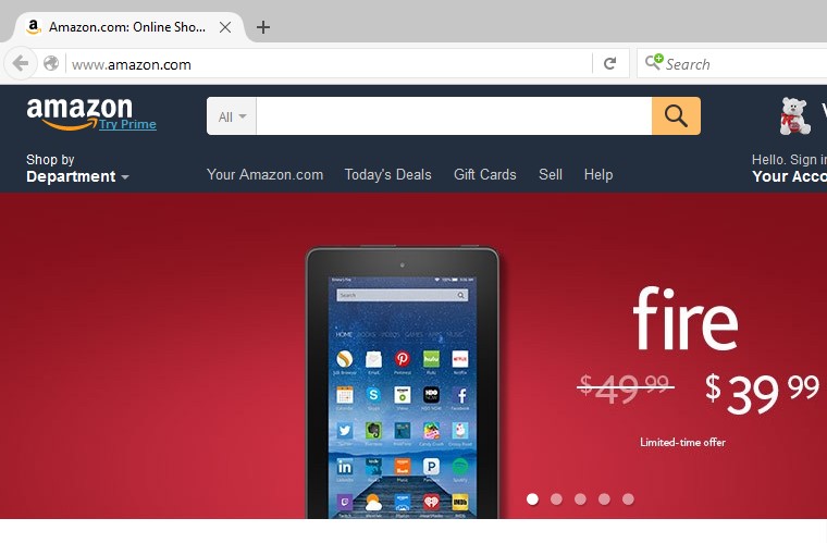
Other major websites are part-HTTP, part-HTTPS. If you type “Amazon.com” in the address bar in Firefox (or if you just search Google for “Amazon”), you will be taken to an HTTP homepage. All navigational and product pages are also non-secure from there.

Amazon HTTP No SSL Certificate

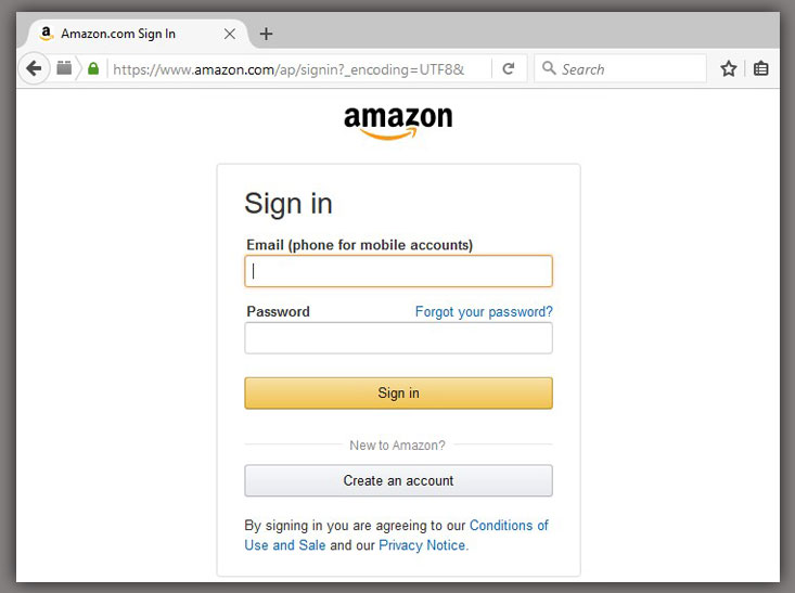
However, as soon as you try to log in or view your shopping cart, you will be taken to an HTTPS page.

Amazon Sign In Security Icon

Amazon actually does work it you type “https” at the start of its URL in Firefox, or if you type just “Amazon.com” in the Chrome address bar, so the company must be in the process, however long, of fully securing its massive site – or at least making sure the user only gets directed to HTTPS pages.

If your website has a shopping cart or any page that asks to user to log in and give some amount of personal information, then you need to look into get those pages secured right away. Users will flee if they can’t trust your website to protect their personal info. A 2014 survey in the U.K. found that 85 percent of online shoppers avoid unsecured websites when making a purchase.

Certificate Authority Options

Now that you’re surely convinced your website needs its SSL certificate, let’s look at some reputable CAs that can vet your company and issue the most reliable seals of approval.

Symantec, producer of the popular Norton AntiVirus software, claims to have secured two-thirds of all websites that have an extended validation SSL certificate. The annual price for Symantec to be your CA is quite high, though. Below are some other CA options, ranked by highest to lowest annual fee for a starter certificate:

Website Security for 2016 and Beyond

While Google has yet to announce that it will no longer feature any HTTP content in its search results, I wouldn’t put it past the web leaders to make such a move in the far-off future. Start upgrading your site’s security today so it won’t get left behind in search if Google ever decides to make such a drastic move.

A legitimate SSL certificate for your website not only helps with organic search engine rankings, but it also lets your visitors know that they have found the authentic domain for your business, rather than a specious alternative that scammers often like to create.

If you’re short on time to undergo the often arduous, long-winded task of receiving an extended validation SSL certificate, Eminent SEO can find and work with a trusted CA on your behalf, as part of our Website Development Services.

In our next post on developments to look for in 2016, we’ll explore the difference between mobile websites and mobile apps and let you know which one is more worthy of your investment going forward.

Avatar for Team Eminent SEO

Team Eminent SEO

Eminent SEO provides strategic SEO campaigns with measurable results along with expert website design, development, pay per click, content and social media and organic website marketing. 800.871.4130.

More Posts - Website

Follow Me:

This entry was posted in Marketing Strategy and tagged , .

What Is Responsive Design and Why Your Website Should Have It in 2016

This entry was posted on by .

What Is Responsive Design - Eminent SEO

What Is Responsive Design?

C’mon, it’s 2016. Time to get with it already. If I land on your website from my smartphone and I have to “pinch to zoom” to read some of your text or see images in their entirety, I’m bouncing off the page.

Also, if the only suitable mobile representation of your company is an app or mobile-only website (such as m.website.com), I’m probably not going to be too happy either.

Robert Downey Eye Roll - Eminent SEO

This is because your website needs responsive design, an ability to deliberately adapt to screens large and small. Websites across the internet have been making the upgrade over the last few years, and just last year Google puts its final say on the matter by de-emphasizing sites that aren’t responsive.

Wait, doesn’t everybody have a responsive design? You’d be surprised. Take Reddit, for example. Other websites utilize responsive design but aren’t all too happy about it.

If your website is a little older and not optimized for mobile devices, 2016 is the year you should make the upgrade to responsive design. No more excuses. You owe it to your company and your website visitors to make your site responsive. While you’re at it, you might as well revamp the appearance of the site and its navigation, while also reviewing your current content and then cleaning it up and making it better.

Let’s dig a little deeper into what responsive design is and how you can go about implementing it in the near future.

‘Mobile-Friendly’ vs. ‘Responsive Design’?

The terms “responsive design” and “mobile-friendly” are close to being synonyms, and they’re often used interchangeably on blogs, web forums, social media, etc. Responsive design means the website can shrink or expand to fit all devices, whether a smartphone, tablet, monitor or even a TV screen.

A responsive website is mobile-friendly, but not all mobile-friendly sites are responsive. Some mobile-friendly sites simply shrink to fit your smartphone, appearing just as their desktop equivalents, only smaller. This isn’t true responsive design.

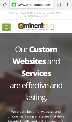
Responsive design also means that elements of the website will condense or disappear from the page as the device gets smaller and smaller, yet the layout and organization still makes sense to the user. The horizontal navigation on responsive websites usually gets condensed into a drop-down “hamburger”-style menu (although some designers are now advocating against the icon), as you can see with the green button below..

Mobile Eminent SEO Screenshot

Responsive design isn’t just about making a website look pretty no matter the device. It’s about fostering a great user experience no matter the device.

Many companies used to get around upgrading to a mobile-friendly website by building a separate phone app that looked and functioned very similarly to the desktop version of the site. Others created sub-domain sites with an “m” right before the website’s name, and these such sites featured either standalone mobile pages or stripped-down versions of the desktop equivalents.

Mobile IMDb Screenshot - Eminent SEO

You don’t have to go either route anymore. Some businesses still have legitimate reasons for creating a separate mobile app, but we don’t recommend doing this in lieu of making the main website mobile-friendly.

Google Rankings and Users’ Habits: The Importance of Responsive Design

SEO analysts disagree on the exact month when mobile search first began to overshadow that of desktop, but it looks like it happened somewhere between mid-2014 and early 2015. Smartphones are nearly ubiquitous now, and users are becoming more and more comfortable with turning to their phones first, rather than their desktop or laptop computers, to search the web, use apps, go on social media, etc. Mobile usage, including mobile search, is only going to continue to get more dominant in 2016.

Another game-changer that happened around the same time as mobile search’s rise to the crown was a Google algorithm update that began to accommodate mobile-friendly sites. This means that sites that weren’t responsive saw a dip in their search engine rankings. When you’re searching Google from a smartphone, you’ll even see the term “Mobile-friendly” show up before the meta descriptions of the applicable pages.

I searched for “Flower Store Phoenix” on my smartphone, and here are my results:

Flower Store Phoenix Mobile Search

There actually are some slight variations between the results after searching for the same term on a mobile phone and a desktop computer. Here is my search for the same term, but this time from a desktop:

Flower Store Phoenix Google Search

What’s interesting to note is that tablets don’t count as mobile searches, according to Google. The mobile-friendly algorithm update of 2015 only impacted searches via smartphones, not on tablets, laptops or desktops. Even if having a non-mobile-friendly site doesn’t negatively impact your rankings in mobile search, you’re missing out on scores of additional visitors because smartphone use is so prevalent now.

If users can’t find your site in mobile search and smartphones are the No. 1 device for search now, how can you expect your website’s visitation to grow?

Responsive Websites are a Part of Branding, After All

Making a website mobile-friendly is actually a component of a strong brand strategy. How? If somebody happens to have visited your site from a desktop before, they might land on your site on mobile search one day and say, “Hey, I’ve been here before.” But, if you’ve built a mobile site that looks and operates much differently than your primary site, then you have a disconnect in your branding.

Also, those who have visited your website via desktop and are familiar with the breadth of your content and navigation should have no trouble accessing your site with their smartphone and finding their way around, even if the navigation gets condensed into a hamburger menu. Making your site adjust easily to all screen sizes is a good strategy for keeping your longtime visitors around, as well as inviting and retaining new ones.

How to Test for Responsive Design

Not sure if your website already has responsive design? Not to worry. There are several free online tools you can use to give you the answer.

First, you can use Google’s Mobile-Friendly Test to see if your homepage or any sub-page of your website is responsive. Just type in any URL from your site, and Google will analyze it and provide you with the answer.

Second, you can go to ResponsiveTest.net and play around with different dimensions of your website. Just type in your URL at the top of the page. If elements of the site rearrange themselves, grow, shrink, etc., then you’ll know you have responsive design.

Eminent SEO Responsive Test Screen Size

A way to test your site without visiting another website is to take your browser out of full screen. Hover your cursor over the bottom-right of your browser and then shrink the window slowly. Shrink and enlarge it as much as you want, and see if elements of your website rearrange, compress, disappear and reappear. If so, great! Your work is done (unless you notice that the website could look a little better at certain sizes).

Difference Between Responsive and Adaptive Web Design

You may have heard the term “adaptive web design” as well. This has to do with coding the website for pre-defined dimensions and deciding what to fit on the screen and what to leave out. For example, the developer would have to code the website differently for smartphone, tablet and desktop/laptop monitor sizes.

In short, adaptive design takes more work than responsive, and you end up spending more money because your developer will need more time to complete all of that work. It also could put you in a bind as new devices with unique screen sizes hit the market in the future.

Some say a responsive website takes a little longer to load than a site with adaptive design, but pretty much everybody is focusing on responsive design right now. In fact, some developers would argue that adaptive design is a component of the responsive process, since you still want to test the look of your website at some of the more common screen sizes, even though responsive allows the site to adjust to any device.

The aforementioned ResponsiveTest.net gives you options for viewing your website at the screen sizes of dozens of the most popular devices on the market. Just look to the upper-right corner of the page for these icons:

ResponsiveTest Screen Size Icons

How to Make Your Website Mobile-Friendly

Now that you’re likely convinced to implement responsive design on your old, static website, let’s look at some ways you can make the upgrade.

If your website is coded by hand, this Google Webmaster Central Help Forum thread will give you a good start on how you (or your programmer) can make the site mobile-friendly. A high level of technical expertise is required if you want to go this route.

A more recommended direction is to migrate your site to a content management system (CMS), if you don’t utilize one already. WordPress, Joomla and Drupal are some of the most popular CMS’s on the market. If you do decide on this option, we’d highly recommend reworking and redesigning your website in general, since it’s likely outdated.

Redesigning Your Website While Making It Mobile-Friendly

Redesigning your site entails looking over your navigation and all of your content to see what needs to be included on the new site and what can be dropped for the best user experience. For example, if you have service pages that only have a couple of paragraphs of copy and nothing else, you’re probably either going to want to add much more content or just work that copy into a larger service overview page.

It’s going to take a few, long hours with your programmer and/or web developer, and even your content team, to decide on the final look and navigation of your new, responsive website, all controlled by the CMS of your choice. Brace yourself.

We Can Help

If upgrading your website with responsive design sounds daunting and you’re not sure if you have the team or resources to make it happen, outside help is always available. Eminent SEO can help you strategically build and design a new, responsive website, and we’ll set you up with an easy-to-use CMS if you don’t already use one. To learn more, see our wide range of Website Creation services.

If you’re ready to get started now on making your current website mobile-friendly, contact Eminent SEO at 800.871.4130.

Avatar for Team Eminent SEO

Team Eminent SEO

Eminent SEO provides strategic SEO campaigns with measurable results along with expert website design, development, pay per click, content and social media and organic website marketing. 800.871.4130.

More Posts - Website

Follow Me:

5 Signs of When to Stop or Redirect a Struggling Online Marketing Campaign

This entry was posted on by .

Struggling Online Marketing Campaign - Eminent SEO

Sometimes, the best-laid plans simply go awry.

This phenomenon is fairly common in the sometimes unpredictable world of marketing. Although businesses can measure most of their marketing efforts like never before, part of the process remains artful, especially in the planning stages.

Every marketing campaign comes with some degree of a chance for failure. Sometimes, the reasons why they failed are obvious. In other cases, the reasons are hard to pinpoint. The answer could be the campaign simply didn’t get a foothold in the public’s consciousness, whether due to timing or other external circumstances.

If your team is currently putting forth an online marketing campaign — such as pay-per-click, email or search engine optimization — here are five signs that it may be time to pull in the reins on the project, or at least hand over the responsibilities to an experienced marketing firm.

1. When You’ve Given it Sufficient Time

It takes a certain amount of patience with online marketing campaigns. Rarely are they fruitful right off the bat. You’ve got to give every piece of the campaign time to coalesce. In the case of SEO campaigns, for example, you may have to wait at least sixth months before you start seeing results.

Before you launch any online campaign, have a time-frame in mind for when you’ll draw down if the effort isn’t paying off. Once you hit that deadline, you should know if it’s worth letting the campaign play out for a little longer or if that’s when it’s time to call the troops home. Just be sure not to abort the mission before you’ve really given it enough time to show signs of success. By the same token, don’t be too proud to call a campaign off if it’s readily apparent that it’s just not going to provide the returns necessary to sustain itself.

2. When Your Adjustments Aren’t Moving the Needle

Even for campaigns that take longer to pay off, you should know fairly soon after launch if the effort is receiving some degree of reception and if it’s on track to succeed. You should know this because of the abundance of digital tools at your disposal to evaluate various aspects of the online campaign.

So, before giving up on the effort, try to make any necessary tweaks to the approach. For example, this could mean using different imagery or a different tone in the copy. Or, maybe you’re targeting the wrong keyword. Also, you can try doing A/B testing to see which variation is getting more traction. If you’ve made adjustments to the best of your ability but the campaign still isn’t significantly getting off the ground, that’s when there would be little shame in calling an end to the whole effort.

Before the campaign reaches the breaking point, you may want to give serious consideration to contacting a business-to-business marketing agency. Yes, it will be more money poured into the project, but the experts you hire should be able to turn the tide on the campaign, as they’ll likely have resources and expertise that goes beyond what you have internally. If you go this route, give the agency your full confidence and ask for frequent updates and key performance indicators.

3. When Your Execution Can’t Get any Better

Similar to making adjustments, if you and your team have all put forth their best efforts and the campaign is still floundering, then it may be time to throw up your hands and move on to the next project. Just make sure you’ve allowed sufficient time for each employee involved in the campaign to perform his or her relevant duties. You may even have to hire new talent internally for this initiative or delegate additional tasks to current employees after launch. If you’ve done all this and the online campaign is still in neutral, then there’s simply a problem with the campaign, and not necessarily with you or your staff. If you identified the issues early on but you and your team still can’t seem to get the campaign to break even, despite everybody’s best effort, this might be the point where you seek help from an outside marketing firm.

4. When You’re Consistently Seeing Negative ROI

One of the areas you want to keep your eye on throughout the campaign is the return on investment. Basically, is the amount of money you’re putting into the campaign equal to or less than what you’re seeing in sales and new customers?

It’s not uncommon to be in the red the first few weeks after launch. After all, investments are often expensive and are rarely recovered quickly. However, if the campaign has been active for several months and is consistently yielding negative ROI on measured intervals of your choosing, you should put a stop to it before it drains your business irreparably.

What if the campaign is in the black but falling well short of expectations? Keep it going, period. It may hugely pay off down the road. Even if it doesn’t, at least it’s eliciting a positive net ROI for your business. If this is happening with your online campaign and you’re still thinking about getting help from a marketing firm, a well-qualified team should be able to take what you have and provide a major boost, reaping sizable rewards for everyone involved.

5. When Other Strategies Are Succeeding

If you have other campaigns and business strategies in place that are succeeding, then it makes sense to ditch the one lagging behind. After all, why keep throwing good money after bad? Something to keep your head up about is if you have several other strategies that are “winning,” then it means your business model is solid. Unless you’ve created a PR nightmare for your company with an unsuccessful online campaign, then have no remorse about calling for an end to an initiative that isn’t working out. It happens to the best of companies.

Final Word

Just because one campaign falls short of the mark doesn’t mean your entire business is doomed. Maybe you patterned the online marketing campaign after what you saw another company do. However, what works for one business isn’t guaranteed for the next.

Don’t beat yourself up for one failed campaign. Collect yourself, get back to what you know your company does well, and build upon those strengths.

A Different Direction

If you have an online marketing campaign that is struggling but that you still think has a chance to thrive, you can turn to Eminent SEO for direction or to hand over the duties involved in the project. Our talented team has powered hundreds of successful online marketing campaigns (SEO, PPC, social media, link acquisition, and more) for clients all over the U.S., starting either from scratch or mid-campaign. We know how to address areas of need, plus we always provide full KPI (key performance indicators) reports to keep you in the loop on the latest results of the campaign. If you’re ready for help or you just want to learn more, call Eminent SEO today: 1-800-871-4130.

Avatar for Team Eminent SEO

Team Eminent SEO

Eminent SEO provides strategic SEO campaigns with measurable results along with expert website design, development, pay per click, content and social media and organic website marketing. 800.871.4130.

More Posts - Website

Follow Me:

Vol. 45: Eminent Is Hiring, New in SEO, Monthly Roundups

This entry was posted on by .

We Are Hiring a Social Media Assistant!

Max Monster We're Hiring - Eminent SEOWe are looking to add a Social Media Assistant to our growing team. This position will be responsible for supporting internal and client social media profile development and marketing campaigns. This typically includes creating, optimizing and managing platforms such as: Facebook, Twitter, Google+, LinkedIn, Pinterest, Tumblr and YouTube.

In this role you will work with the Director of Social Media and other key members of the team in a fast paced, open office environment. This is an exciting opportunity for a high-energy, results-driven individual that is looking for an entry level position with a company that has growth opportunity. The ideal candidate will have extensive experience in social media management, content development or digital marketing.

Please submit your resume to hello@eminentseo.com for consideration. Feel free to share this with anyone who might be a good fit!

What’s New in SEO: Bing Organic Traffic Drops, Google Search Console Warnings

There were a slew of changes in the SEO world in July that are going to have implications for websites’ search engine rankings and organic traffic going forward.

For starters, many webmasters were seeing a drop in organic traffic from Bing, but a huge jump in Bing referral traffic. What’s up with that? About a week later, a Bing spokesperson said it had to do with the search engine’s migration to an HTTPS protocol, and that websites might see their drop in organic traffic continue as Bing tries to roll out encrypted search.

Also in SEO, Google began sending out warnings through the Google Search Console to websites that appear to be blocking their CSS and JavaScript coding from the search crawlers. If you’re blocking Google from seeing your website’s CSS and JavaScript, for whatever reason, now’s the time to fix it. Google initially hinted at this in October 2014, and the company is now getting serious about it. Google warned that any websites continuing to block their CSS and JavaScript assets will suffer, to some unidentified degree, in search rankings.

And the big news of July was an update to Google’s Panda algorithm. Look in the Marketing Blog Roundup section below to learn more about Panda 4.2.

July Eminent SEO Social Media Roundup

July started out with a bang, literally, as we celebrated #IndependenceDay. On our social media accounts last month, we also ruminated about Mondays and Fridays, and all the emotions that come with those two days of the work week. Additionally, we looked back at the original version of our brand mascot, Max, and compared him to his modern-day self. Which image or post from July is your favorite?

July 4th Fireworks - Eminent SEO


Max Meg Picnic - Eminent SEOAdult Internet Users - Eminent SEODos Equis Reply All Email - ESEO


Need More Coffee - ESEO MaxHappy Hump Day - Eminent SEOFriday Camden Baby - Eminent SEO

July Marketing Blog Roundup

Through the blogs on our Eminent family of websites, we stayed busy in July sharing the latest in online news while giving plentiful marketing and SEO tips. A Google algorithm refresh began to roll out in the second half of July, and that was the big news of the month. We let our readers know more about those implications, and we also added an in-depth post to our blog on how to recognize and get rid of spammy referral traffic. We invite you to read our top blog posts from last month (featured below), and we encourage you to follow our blog for more great marketing tips and SEO-related news.

Why You Should Outsource Your SEO to a Digital Marketing Agency Instead of Hiring a One-Man Show

Boosting your website’s visibility with search engines is a complex, ongoing process, and it’s often too large of a task for one person to handle in house. In this post, we tell you about the benefits of hiring a full-fledged digital marketing agency to handle your SEO, as opposed to a “one man show” or even a small SEO-only firm.

Spammy Referral Traffic: What Is It and How Do I Get Rid Of It?

Some web referrers may be giving your site an artificial boost in traffic, and it can be hard to recognize where it’s coming from. In this post, we guide you through the detailed process of recognizing spammy referral traffic and blocking those problematic sources through Google Analytics.

Has Panda 4.2 Arrived? What to Know About The New Google Algorithm Refresh

In the middle of July, a tweak to one of Google’s algorithms went under many webmasters’ radars. Read more to see if Panda 4.2 is a full-blown algorithm update or just a refresh. Also, you’ll learn how fast it is rolling out and how many search queries it’s effecting.

Basic Guidelines for How Your Business Can Gain Traction on Instagram

Have you created an Instagram account for your business recently or are just having trouble getting any traction on the platform? Get some ideas here about the best practices to follow on the social sharing app, and soon you’ll start to see a larger following and increased engagement.

Avoid These Social Media Mistakes that Harm Your Brand Reputation

Yes, almost every company out there, big and small, has created an account on multiple social media platforms at this point. However, some businesses are using social media in a way that harms their brand more than it helps it. Read this post to learn about the main social media mistakes to avoid if you’re trying to maintain or improve your brand reputation.

Featured Service: Website Design

Did you know that we are MUCH more than internet marketers? We offer custom website design services for clients who need a new website or want to refresh an older, outdated site. This includes:

• Custom Website Wireframing
• Siloed Website Architecture
• Logo and Brand Identity
• Beautiful Graphic Designs
• Fully Responsive, Mobile Friendly Web Designs
• Branded Social Media Designs
• Designs for Print
Website Design Bottom Line - Eminent SEO

Companies with well-designed websites can increase their sales by 50% or more. You need strong design.

Visit our Custom Website Design Services page to learn more. Or, let us know if you are interested in a new design and we can provide you with a custom quote. Just call: 800.871.4130.

Until next time, see ya online!

Avatar for Team Eminent SEO

Team Eminent SEO

Eminent SEO provides strategic SEO campaigns with measurable results along with expert website design, development, pay per click, content and social media and organic website marketing. 800.871.4130.

More Posts - Website

Follow Me:

4 Reasons Why Your Website Conversions Are Lacking

This entry was posted on by .

Website Conversions Lacking - Eminent SEO

So you’ve taken all the textbook steps to drive traffic to your website: You’ve implemented target keywords, the copy reads better, you’ve added high-quality images, you have a responsive design, and then you’ve seen a rise in Google’s search rankings.

However, perhaps all those changes aren’t driving results to your business website. What if your sales numbers from the website remain flat or barely eclipse what you were doing before? Where did you go wrong? Well, it could be a multitude of reasons, but, in short, maybe you’re still trying to understand your customers and figure out what motivates them to buy from or reach out to you.

Several psychological and cognitive factors are in play when somebody 1) lands on your website from search, and 2) decides whether to follow one of your calls to action – anything from subscribing to your newsletter to purchasing a product or service from your company. Let’s take a look at four of the primary reasons why there may be a disconnect between your volume of traffic and the number of conversions.

You’re Deluging Them with Technical Information

When somebody lands on a page where you’re trying to sell them something, do they initially see a plethora of long, technical paragraphs or a seemingly never-ending list of bullet points? Have you loaded up on specifics about your product or service before even hitting the fold of the page?

If the answer to those questions is yes, then you’re going to want to dial back how much information you’re hitting a potential customer with as soon as they land on the page in question. What you should do instead is focus on strong photos and graphics, particularly if they illustrate how the product is supposed to work.

You’re welcome to get into the finer details beneath the fold, but near the top of the page, you can get away with a little as a sentence or two – or even a couple of carefully crafted short phrases in large font – that describe what your product or service does, including the problem it might solve. If you head over to our home page, you’ll get a good idea of this theory in practice.

Too Many Calls to Action (CTAs)

Too many options can often be a problem, as the customer may become overwhelmed and click out of your website rather than taking a step forward. When you’re trying a drive traffic to a landing page on your website, does that page have an abundance of calls to action, such as “sign up,” “subscribe,” “order,” “enter your email,” “enter to win” and “call us”?

Just as you should be cautious with the amount of information you present above the fold about your product or service, you should also take it easy with the number of CTAs you have in that space: One is usually ideal. Furthermore, the number of CTAs on the page overall should be low and manageable. If you’re trying to lead the visitor in one of umpteen directions, he or she will likely take one route instead: backward.

The Page Lacks Direction and Is Confusing

Even if the top part of one of your landing pages is light on copy about your product or services, as recommended above, that doesn’t mean the visitor to your site is always going to know what step to take next. If the page is broken into a variety of different sections and there are a multitude of colors, buttons and other elements in play, the potential customer may be confused about which area to concentrate on, including glossing over the part that would have appealed to him or her otherwise.

Make sure there’s a clear focus on what each page on your site is supposed to be about, as well as how each image helps direct the user to what you want to sell. For example, if there is a person in one of the photos, try to have their eyes point toward a specific call to action on the page. When you start thinking about how to clearly direct visitors to the money-making clicks on your website, you’ll then take the steps necessary to bolster interaction and engagement on the page.

You’re Not Sure What’s Getting Clicked on and What’s Not

Another issue that may be effecting your website conversions is you haven’t figured out what motivates your existing customers and where they’ve clicked on a web page. One easy step to take is to grab somebody from outside your company – like a friend or a family member – who has never seen the page you’re hoping to bolster. Have that person sit down and interact with the page with no prior knowledge of what to look for, and get their feedback on what they’re viewing, including what they’re inclined to click on. Your confidant’s actions will give you an idea on how new visitors to your site are taking in what you present to them.

A helpful tool for understanding where exactly on a page visitors are clicking is a heatmap, offered by companies like CrazyEgg. Once you can tell where they’re clicking, you’ll get a better idea of how to organize the page. For example, do you have a video near the top of the page that is getting ignored? Perhaps you can move it to the bottom, or just strike it altogether, in favor of a more popular element that’s below the fold. Your conversion rate should jump as soon as you realize some of the areas that are undervalued and need to be featured more prominently.

Final Thoughts

The common denominator between the items above, specifically the first three, is clutter – meaning you want to avoid clutter on any landing page of your website, especially above the fold. In the top area of a page, you want to entice somebody to take one step closer to a purchase, and you can get into the nitty-gritty of the product or service later in the page. You also want to visually guide visitors toward the desired calls to action on your site, and understanding where they click now will help you decide how to better organize your content going forward. Take each of the steps above, and then watch your conversions take off.

Avatar for Team Eminent SEO

Team Eminent SEO

Eminent SEO provides strategic SEO campaigns with measurable results along with expert website design, development, pay per click, content and social media and organic website marketing. 800.871.4130.

More Posts - Website

Follow Me:

When to Launch Your New Website Design

This entry was posted on by .

When to Launch Your New Website DesignYou finally took the plunge and decided to re-design your website. Whether you’re redesigning it because it isn’t mobile responsive, or you simply just had an outdated website – bottom line is you needed to make this leap.

Now comes the common questions: When do I know if it is complete or not? Did I include everything I should? Does my website sell my product effectively?

You don’t have to feel overwhelmed when it is time to transfer your development site into a live environment that users can view and the search engines can index. Always stick to your bottom line – does your website spell out what is unique about your company and reveal your brand’s selling proposition immediately? If not, you may need to work on the design a little bit more to ensure it is influencing your audience through the correct messaging.

What You Need to Know Before Launching Your New Design

Stop Focusing on Little Content Tweaks and Focus on Your Overall Message

It can be daunting to go over every single piece of content on your website, especially if you have a larger site. The good news is, minor content errors can be fixed after it goes live. Instead of worrying about minor content errors, focus on understanding the goal of each page. Does each page represent something crucial to your business and is it sticking to your brand messaging? If your website clearly defines what you do, how your business is unique, and where to go to purchase – you’ve got your most important bases covered.

Don’t Let Your Website Design Take 6 Months to Accomplish

We see this all of the time. Companies will take months to complete a simple re-design that should’ve taken 30 days. There can be a number of reasons why this happens, however, business owners need to think of the bigger picture at stake. The longer you take to push your website design live, the longer it’s going to take to gain any return on investment from the new design. You can keep running the marketing campaign to prevent any huge losses, but you need that new design in order for your updated marketing strategy to be successful.

Your Website is a Constant Work in Progress

Most website design agencies will utilize modern design principles when designing your website. However, a lot more goes into a design than “pretty” graphics. It’s more about the psychological aspect of how users are navigating through your site. How do users feel when they land on a web page? Your website is a constant testing ground for conversion since you won’t know how users navigate your new website design until it’s actually live. Look closely at the conversion funnels in your Google Analytics to identify where you’re losing users. Re-designing, re-writing and re-optimizing internal pages of the site may be a constant work in progress until you’ve reached a conversion rate you’re happy with.

Forward Thinking is a Must

Content development and site architecture can be a large piece to a website design. You have to think about now, and the future, when developing the site architecture and content. Make sure your voice is consistent, your site architecture is easily expandable, and your content all leads to one main conversion goal. You also need to be forward thinking, so that all of your other marketing collateral and strategies align and meet your short and longer term goals.

How to Know If Your Website Design Is Ready to Go Live

Don’t let all of the little things get you off track. The real goal of the website design is to show off your product or service and show why your brand should be chosen. When your content messaging clearly defines your product or service when you hit the site – your content is ready to go.

What about everything else? To know if your website is good to go, it must be thoroughly tested for quality assurance.

What to Test Before Launching Your New Design:

  • Test all contact forms to ensure emails are being received.
  • Test the shopping cart to ensure products can be easily purchased without any glitches.
  • Manually click each page on throughout the navigation to ensure it is pulling up properly.
  • Manually click all links on the site to make sure none are broken.
  • Make sure all of your images and videos are properly sized to prevent slow loading times.
  • Check everything on mobile separately to ensure a quality mobile experience.
  • Make sure all of your pages are properly siloed in the navigation, meaning the URL coincides with the parent category.
  • Install all of your necessary plugins for SEO and social media.
  • Install Google Analytics and Google Search Console on the new site.
  • Install any other tracking metrics, such as Call Tracking Metrics.

These are just some basic things to look for before pushing your site live. For a full list, check out our website checklist.

Closing Thoughts

Always go into a new design project with a plan and forward thinking. The whole point of re-designing, or designing a new site from scratch, is to show off what’s unique about your business. Be prepared to explain your unique selling proposition to your web designer, so that they can understand your vision. From there, your website design agency should be able to take your vision and turn it into a beautiful, modern design that is also practical for your on-going marketing strategy.

Looking for custom website creation services that can increase your website traffic and conversions? Call our website design specialists today: 1.800.871.4130

Avatar for Team Eminent SEO

Team Eminent SEO

Eminent SEO provides strategic SEO campaigns with measurable results along with expert website design, development, pay per click, content and social media and organic website marketing. 800.871.4130.

More Posts - Website

Follow Me:

This entry was posted in Design & UX Optimization and tagged , , .

Why You Should Outsource Your SEO to a Digital Marketing Agency Instead of Hiring a One-Man Show

This entry was posted on by .

hiring a digital marketing team - Eminent SEO

When it comes to growth, unless your business relies solely on word of mouth or printed collateral, you’re going to want to explore the huge potential that marketing in the digital realm offers.

More than likely, you already have a website established for your business, and perhaps you’ve already set up a few social media accounts. However, your business could be losing out on a huge stream of leads if your website is not showing up high in Google search rankings. That’s where search engine optimization (SEO) comes in.

SEO is more than just plastering a certain keyword across a website page and earning (or buying) backlinks to your site. It’s now about overall user experience and whether Google considers your website an authority on a particular topic.

Improving your website’s search engine visibility is a multifaceted approach, and it’s often a tall order for just one person to handle. Let’s take a look at the benefits of hiring a  full-fledged digital marketing agency to handle your SEO rather than hiring one person or an SEO-only firm.

Website Assessment: SEO Considerations

Certainly you can hire one individual within your company or a freelancer to look at each page on your site and optimize them one by one with keywords and headlines; however, the hired hand needs to consider the overall look and feel of the website – its design and the ease of navigation.

Getting the right keywords on a page should help your website rise in the search rankings, but even if you’re seeing any increase in clicks, you may not necessarily see a rise in sales or even incoming phone calls. If the website still has an outdated design and the copy is written awkwardly or blandly – even with the appropriate keywords – you will likely see a high bounce rate, which means potential customers have backtracked to their search results and are looking for the next company in your industry that’s going to catch their eye.

So when you hire somebody to boost your search rankings and conversion rate, that person (or team) needs to have the resources to improve aspects of your website from layout and design to even your company’s logo, should any of those items be problematic. If your website has a modern design and if the copy is written intelligibly and even authoritatively, you may start earning backlinks from other reputable sites, a concept which also boosts your visibility on Google. SEO is a dynamic and continually evolving process, and asking one person or even a small team to address every aspect of your website’s SEO is a tall task.

Is Your Website Mobile-Friendly?

Does your website adjust well to handheld devices like tablets and cellphones? No? Well, not only will it frustrate people who have found your website via one of those devices, but you’re also holding yourself back from a higher ranking on Google.

To make your website more responsive, you’re probably going to want to look for a web developer, one who not only has a high degree of programming skills but also can distinguish a good design from a poor one. In many cases, those are jobs for two different people, but if you can find one person who is experienced in both areas – not to mention copywriting and keyword research, among other skills – then more power to you. It’s not going to come cheap though, whether it’s somebody you hire on staff or if it’s short-term freelance work.

The Cost-Effectiveness of a Digital Marketing Agency

Let’s recap the primary areas in which you have to be skilled to improve and maintain the SEO of your company’s website:

  • Keyword research
  • Copywriting
  • Web design and content
  • Programming
  • Graphic design
  • Social media
  • Email campaigns
  • Website traffic analysis
  • Monitoring backlinks and mentions of your business online

There are even other factors that play into your website’s search visibility, but we’ll leave it at these for now. As you can imagine, you’ll have to search long and hard for even one person that claims to boast all of these skills, and if you do find him or her, it’s not going to be very cost-effective for your business.

The best route to take is to search for a digital marketing agency that can juggle all of these tasks and do so with a commitment to helping your company put its best face forward in the digital world. You may find SEO-oriented micro-businesses or freelancers in your area who can look up the most-searched keywords in your industry and rewrite the copy of your web pages, but it’s not likely they will possess the skills or resources to upgrade the look and user experience of your website, especially if those are glaring deficiencies.

Instead, opt for a digital marketing agency that can address every SEO consideration of your company’s website and digital presence. And if the marketing firm offers to manage your social media accounts, it’s only a bonus. You should be able to find an agency that will cost you less per month than you’d pay one person who may (or may not) possess all of the skills needed to improve your website and its search visibility.

An Agency that can Handle ALL of Your SEO Needs

Since everything from website design to social media strategy has search engine optimization implications, Eminent SEO has the resources to bolster every aspect of a company’s digital presence. We can assess your website and your online marketing strategy and then recommend and execute the necessary improvements.

Does your website need a complete overhaul or do you need a new one from scratch? Eminent SEO can show you some options and turn your wish into reality.

But maybe you just need to optimize a handful of landing pages on your site: We can work with you on a month-to-month or long-term basis – on whatever the size of project that works with your budget.

Looking to Boost Your Website’s Traffic and Conversion Rates?
Eminent SEO Has Solutions For You:
1.800.871.4130

Avatar for Team Eminent SEO

Team Eminent SEO

Eminent SEO provides strategic SEO campaigns with measurable results along with expert website design, development, pay per click, content and social media and organic website marketing. 800.871.4130.

More Posts - Website

Follow Me: