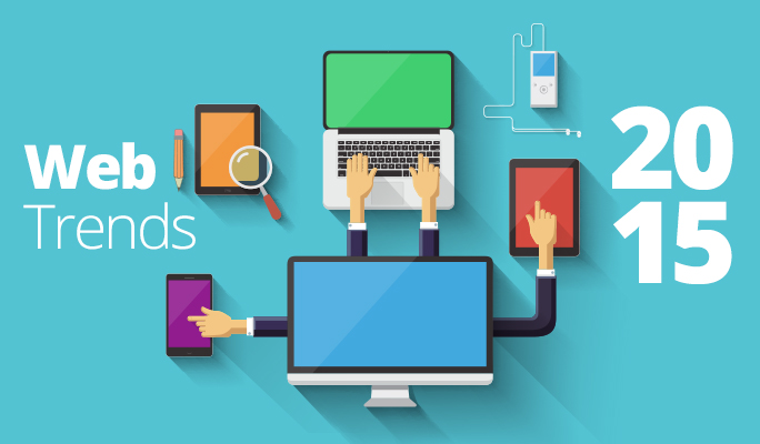
With the year more than half done many people are turning their eyes towards 2015. We are no different, which is why we are already forecasting the web design trends for 2015. While this year has already produced countless web and graphic designs that make heads turn and increase quality page clicks, looking ahead is never a bad idea, especially for those businesses considering a web re-design to help launch the new year in style.
Even though 2014 had a lot to show us, we wanted to speculate on the trending web techniques for 2015. And, since we are already 8 months into 2014, there’s no better time to do it! With so many businesses looking to re-design their website by the start of the new year we though it was time to reveal our findings… here they are.
2015 has a lot in store for us, and here are just a few design trends we feel are going to be high-trending:
1: Compelling Type-treatments
With advancing development frameworks and a little help from Google Fonts, it’s becoming easier to use specialized fonts inside your website design. Font kits were used in the past to enhance a small amount of typography on the site, but they were clunky and didn’t work well in all browsers. Now it has become easier to express a style and match your brand messaging with the type of fonts that are used without the concern of a misrepresentation on certain browsers and devices.
Typography is now an art form that can can transform the look and feel of your website, adding to additional user experience and enhances your overall brand message. Quality fonts are now more available, and if you’re looking for something a bit more than what Google has to offer but don’t want to break the bank – don’t worry, they are cheaper than ever before as well.
2: Responsive Design and Development
Responsive design has become an imperative standard with website’s in today’s age of the internet. Statistics show that mobile device users are becoming more commonplace and are soon to be a majority of website viewers. It’s difficult enough to keep the attention of a normal website-user, but if your site isn’t user-friendly for a mobile device, you’ll find yourself losing a lot of potential customers. Responsive design and development will give your website scalability so that it has the ability to showcase well on desktop computers and most mobile devices, without sacrificing your website functions and goals.
3: More Use Of Flat Design
In 2013 flat design WAS BORN! Well, not exactly born, but sensationalized. Prior to flat design, web designers used a graphic technique called “realism” which applied different styles to web elements such as gradients, shadows, bevels, etc. Most of the time this worked well, however, designers felt like they needed a shift in the way graphics were presented inside of a website, hence, flat design was born. Flat design removes almost all of the extra stylization to the graphics and modernizes the way web elements are viewed. Solid and vibrant colors against the bold, blended pallets are the new norm. It also helps developers use CSS to create web elements without having to always rely on images, which decreases page load times.
4: Large HD Imagery
Having images on your website has always been necessary, but now full screen, high-definition images are a must-have. Having compelling headlines and your important calls-to-action overlayed on top of a compelling and relevant image is a great way to catch the attention of your customers and express a specific message. This is especially important to mobile users that are used to seeing images on their phone over small, hard-to-read text.
5: Page Fold… A Thing Of The Past!
Having a multi-page website is fantastic for SEO control, but more and more websites are being viewed on mobile devices and clicking on a navigation link can be a hindrance to the user experience. Mobile users seem to prefer scrolling to sections on the page over having to click to navigate. Using this new trend, many websites are being designed as a single page website, or panels are created, to enable a better user experience for individuals using mobile devices.
In Conclusion:
All-in-all, websites seem to be using some intuitive techniques and more modern designs to capture the attention of their website users. We think 2015 will bring even more tools to express your site’s message in a very compelling way for even better user experiences.
What do you think 2015 will bring?
Are you ready to get a jump start on designing your new website? Contact us today to get started! We create beautiful, user friendly and mobile ready website that are innovative and ready for the trends of 2015!


Great article.
Having read this I thought it was really enlightening. I appreciate you taking the time and effort to put this short article together. I once again find myself personally spending way too much time both reading and leaving comments. But so what, it was still worthwhile!
Everything is very open with a very clear description of the challenges. It was definitely informative. Your website is extremely helpful. Thank you for sharing!
I pay a visit everyday a few web sites and information sites to read articles, except this website provides feature based articles.
This paragraph gives clear idea in favor of the new
users of blogging, that in fact how to do blogging and site-building.