Your website is beautiful, easy to use, has a great landing page, and seems to check all the boxes to hit your target audience. While traffic seems to be heading your way, the conversions just aren’t happening. After some time, you may even start to question the product and wonder if it just isn’t what users are looking for. Consider that the question may not need to be about the product itself, or even about the common UX elements of your page, but instead about the colors on your website. Color may not seem like an important detail, but it could be the difference maker for the success of your users’ experience.
To that end, choosing the right colors for your website may seem easy. Just pick a few colors that go well together, add it to a beautifully designed page, and its inherent appeal will do the rest, right? The importance of color scheme in web design is more than just picking colors that go well together. Colors elicit attitudes and emotions within people and those reactions could make the difference in determining a website’s success. While your website may look nice visually, are your color choices having the effect you intended?
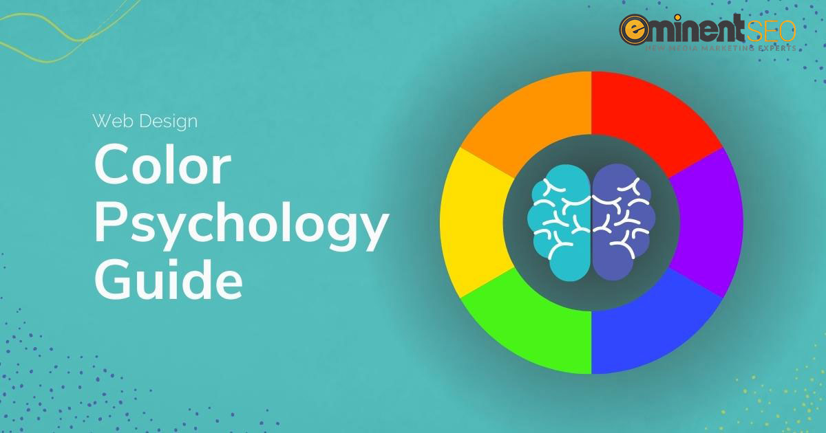
Let’s look at how color psychology in design plays a role in web development.
Color Psychology in Design
The field of industrial psychology may sound fancy and complex, but it’s really just the study of how work and organizational settings impact humans to create viable solutions. Within this field, there are many subcategories, including color psychology. Color psychology is a study of how certain colors, color patterns, and color combinations create emotional reactions in people. With this information, professionals can design products, marketing materials and websites with the intent of creating specific, emotional reactions within consumers. For web visitors, these reactions are meant to influence and increase interactions with and conversions from the page.
Understanding how to use color psychology in web design and knowing the right way to use can be a difficult undertaking. It is more than browsing a list of colors that are said to evoke the response the client wants and slapping a few colors on the site. It takes careful curation and planning to ensure that a website’s color scheme evokes the reaction it is trying to achieve.
Just as with any marketing approach, there is no one-size-fits-all color psychology schematic. Combining the knowledge of colors with the identification of the target audience and the intended purpose can create a persuasive site that yields the desired results.
Colors in Web Design
Colors are broken down into two overarching categories we all remember from elementary school: primary (red, yellow, blue) and secondary (green, orange, purple). Primary colors are the three basic colors, while secondary colors often exhibit blends of the two primary colors that created them.
Within these two categories, each color elicits different emotional responses:
The Emotional Meaning Behind Red:
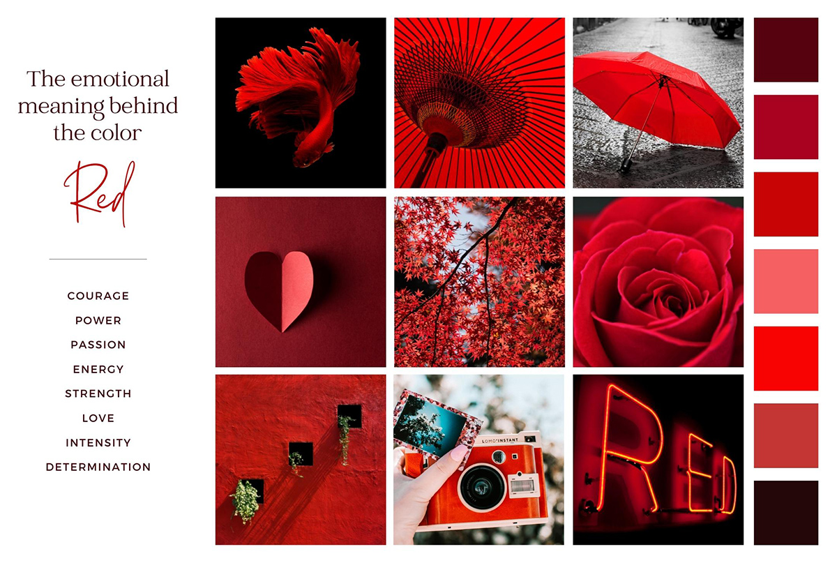
- Used in creating excitement or urgency (think red-tag clearance sales)
- Stimulates passion and energy
- Can be used to increase appetite
- Attracts the most attention, but can be overstimulating if overused
- May be a great option for flash sales, sports, entertainment, emergency services, fashion, and other services where the goal is excitement, anticipation, and urgency
The Emotional Meaning Behind Yellow:
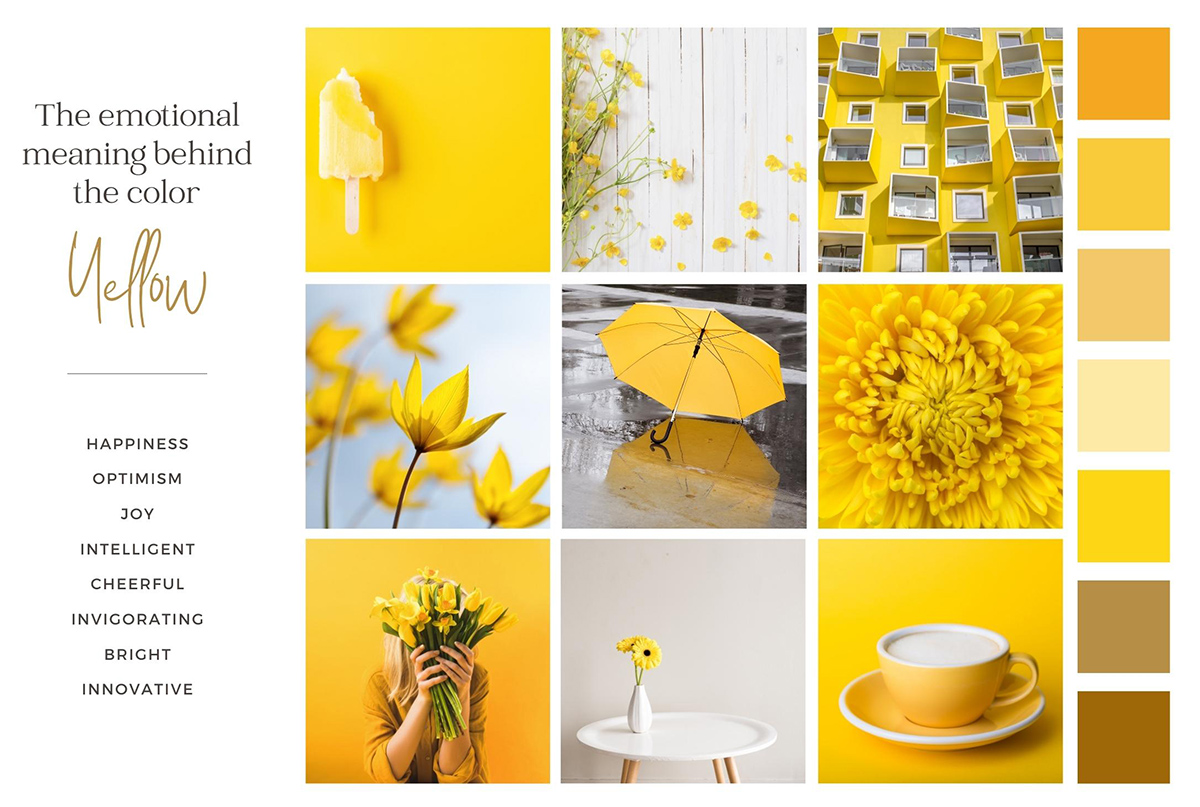
- Think of the sun, promoting cheerfulness and warmth
- Encourages rational thinking, insightfulness, and freshness
- An attention getter (yellow cab anyone?)
- Associated with honor and loyalty
- Because of its association with the color of gold, this may be a great option for financial institutions or firms that help clients with money
The Emotional Meaning Behind Blue:
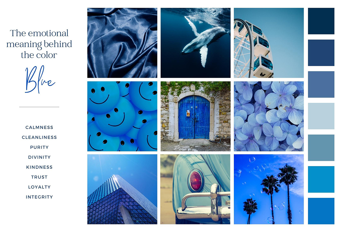
- Invokes that feeling you might have listening to the waves, one of calmness and serenity
- Promotes stability and intelligence
- Color associated with trust
- Creates a sense of security
- Is cool to the eyes
- Blue can sometimes be seen as personal
- Acts as the opposite to red
- May be a great option for certain health care fields, government, law firms, and other industries where calming or easing the target audience is desired
The Emotional Meaning Behind Green:
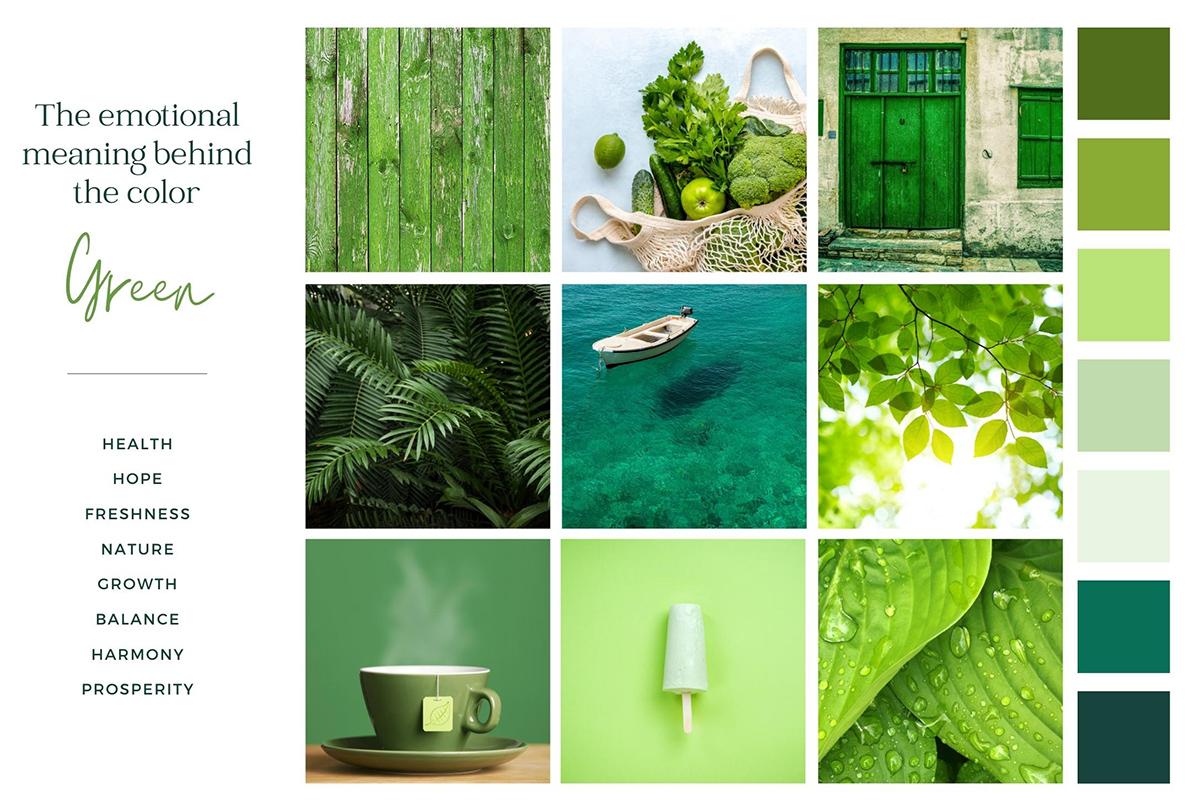
- Strongly associated with nature and natural elements
- Promotes purity, health, and freshness
- Often a reminder of growth and productivity
- Like blue, promotes a sense of calmness
- Can be seen as a sign of decisiveness
- May be a great option for environmental organizations, science, tourism, and other industries where tranquility, sustainability, or sincerity are important
The Emotional Meaning Behind Orange:
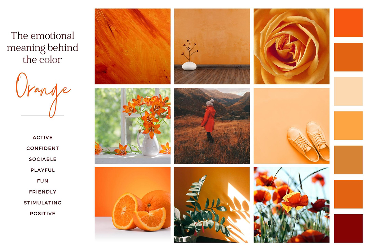
- Acts as a middle point for yellows’ cheerfulness and reds’ intensity, encouraging rejuvenation and positivity
- Symbolizes value and energy
- Stimulates a desire for free expression and a release of inhibitions
- Generates optimism and excitement
- May be a great option for technology, automotive, food, and other industries where value, taking chances, or energy are associated
The Emotional Meaning Behind Purple:
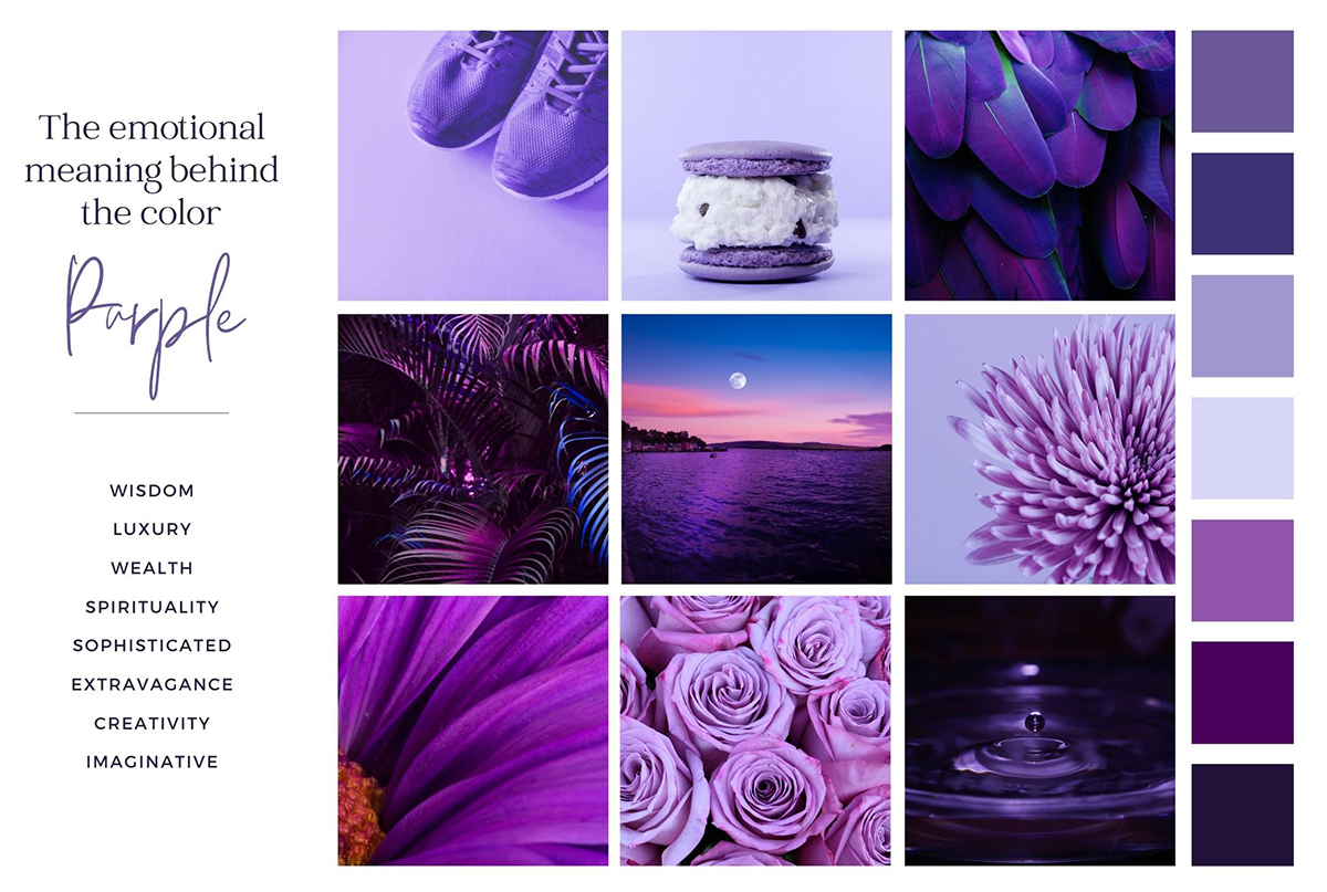
- Blends the calming of blue with the energy of red
- Often associated with royalty, promotes luxury, opulence, and ambition
- Appeals to wealth and extravagance
- Promotes mysticism, magic, and creativity
- May be a great option for beauty, spa services, spirituality and other industries where calmness, wisdom, and good sense blend together
Exploring the Meaning Behind Other Colors
While the list could go on about the many other hues in the spectrum and the varying shades, color psychologists note a pattern that is important for web designers to follow. The associations created between shades of these basic colors and things they already represent in our world can be a significant indicator of what types of color schemes you should use in your design approach.
For example the color white makes many people think about nurses, doctors, wedding dresses, linens at a hotel, a blank Word document, and much more. All these associations have characteristics of purity, cleanliness, and even innocence. If those are qualities you’d like your website to exude, consider using a good deal of white space.
For contrast, you might consider the color black. Think of “black tie affairs”, the American Express Black Card, and luxury vehicles. However, remember the color also harbors negative connotations, like funerals, mourning, and darkness. The complexity of black also creates a versatility. While it can symbolize mourning or loss, it is also a sign of luxury, sleekness, and edge.
To look at color psychology another way, consider that each color exists as either a cool or a warm color. Then, consider that warm and cool colors do precisely that—heat up or cool down the user’s emotions. If promoting a sense of calmness, use a cooling color such as blue or green. If you’d like to promote a sense of urgency, use a warming color such as red. Often, this effect can be associated with the elements of water and fire, as well. Water is represented by shades of blues, greens, and purples, while fire is associated with shades of reds, oranges, and yellows.
What Is the Importance of a Color Scheme in Web Design?
Having the basic understanding of both colors and the intention of the website can help to create the palette that will appeal to the target audience. This involves also understanding how colors work with one another. There is certainly a wide variety of color schemes, but these are the five most common ways to combine colors.
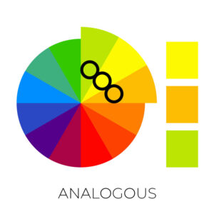
Analogous Color Pallet
This is simply the combination of three neighboring colors on the basic 12-color wheel. Because they are neighboring, they will easily flow well with one another. For example, if you know you want to use yellow, then you can choose to include yellow, yellow-orange, and orange. Or you could choose green-yellow, yellow, and yellow-orange, depending on the emotions you want your audience to experience.
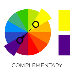
Complementary Color Pallet
This color combination involves selecting colors that are opposite one another on the 12-color wheel. One of the most commonly utilized color combinations implementing this scheme is that of orange and blue. Another great example of this scheme’s usage are the Christmas colors, red and green.
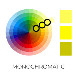
Monochromatic Color Pallet
Monochromatic color pallets include three shades, tones and tints of one base color. This style provides a subtle and harmonious look. This is a versatile color scheme that’s easy to apply to design projects, especially those for a brand that is focused on one main color.
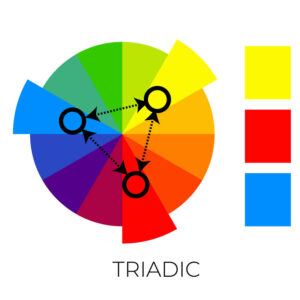
Triadic Color Pallet
Triadic color schemes are a little more involved. Take the 12-color wheel and then put an equilateral triangle on top of it, noting each color the three points land on. Choose one as the main color, and then bring in elements of the other two. For example, If orange is the main color, then adding hints of green and purple would create an appealing palette.
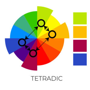
Tetradic Color Pallet
Tetradic color schemes use four colors evenly spaced on the color wheel. They’re bold and work best if you let one color be dominant and use the others as accents. The more colors in your palette, the harder it is to balance.
Choosing the Best Background
Now that you know what colors symbolize and how to choose the best palettes, you need a sturdy foundation to place it on. The background of a website plays a significant role in creating the desired impact of the color choices. The default is a white or light background, evidenced by the fact that most creative opportunities start with a white foundation (think Word documents, a piece of paper, a painter’s canvas). Dark backgrounds aren’t out of the question—they look particularly striking when paired with brighter colors or white text. However, the downfall to darker backgrounds is that it is often difficult to read smaller text, especially in large doses.
A strong consideration in background design is the ever growing number of users who use mobile devices instead of computers for web interactions. A small screen with a black background and tiny white lettering is not very user-friendly. Consider that the smaller the screen, the more color must be absorbed at once—this can create confusion instead of inviting a positive experience.
Also, all of us should be working on making our websites more ADA compliant and although WCAG 2 does not prohibit any specific color or color combination, the color contrast of your web page does matter. And, it should be noted that general web design standards do not recommend white text on a dark background.
Don’t Overthink It
While all this color talk might have you seeing rainbows, it is just another tool to help enhance the productivity of a website. When in doubt, keep it simple. Over complicating the color usage on a website can make it difficult for the user and can confuse the psyche.
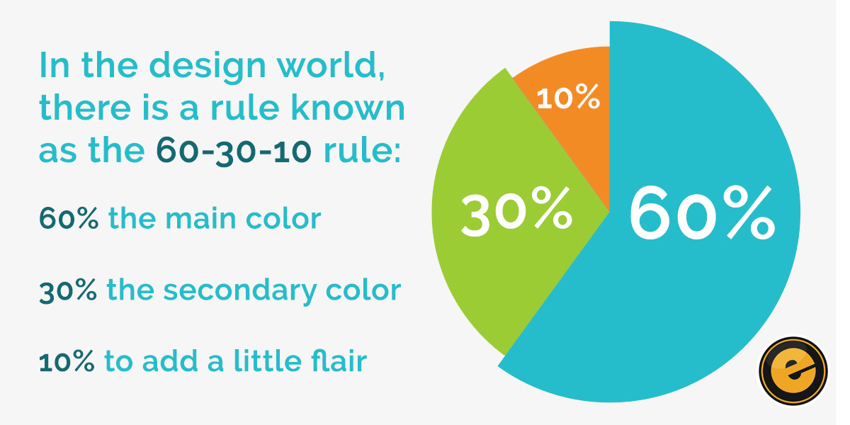
In the design world, there is a rule known as the 60-30-10 rule: 60% of the site should be the main color, 30% the secondary color, and the remaining 10% should add a little flair.
Use your main color as the basis for what will promote the main content. However, don’t use this as your background—instead, use a secondary color that is light enough to serve as a pleasing basis for the color selected for the main content. Then ,identify a color that can be used to capture the user’s attention for specific elements of the site.
Keep in mind that oversaturation of one color can create the opposite of the desired impact. Varying color hues within the same family can help to create smooth transitions as the user’s eyes move from one location of the page to the next.
Is Color Psychology the Solution?
We’d love to tell you that choosing a few colors will solve your conversion issues. The reality is that color interpretation is quite subjective. A visitor to your website brings their own emotions and perspective with them, which can change the way certain colors are interpreted. For example, certain colors may be interpreted differently in different cultures, religions, and countries. There is truly no way to account for everyone.
However, the above basics are grounded in research, and are a great way to start rethinking the message your website is sending. As mentioned, there is no one-size-fits-all when it comes to choosing colors for a website. Still, creating opportunities to enhance the user experience can drive additional conversions and help your company continue to find success in the online marketplace.
Make the Most of Your Website With Help From a Professional Web Design Agency

Using these color rules, the best way to test the success of colors on your users is through trial and error. Of course, you don’t want to change your website every day, but a skilled web designer and marketing/SEO team can run tests to determine which subtle changes in hues and color schemes work best for you. This is another way to keep your website fresh and up-to-date.
At the end of the day there are no rules that say what colors to use in your web design, but understanding the science behind colors will allow you to use them purposefully, strategically, and beneficially. The human brain is a complex organ and we are constantly learning new things about it. The more we understand how to appeal to various parts of the brain, the more engaging marketing we can produce.