On the face of this notion, you might think that I’m ashamed of marijuana use as a whole. You could believe that there’s an insinuation here, that cannabis-related businesses should act as though they’ve got something to hide.
According to the federal government, they do. Facebook, Google and Amazon might concur with that sentiment as well because as long as cannabis product and service offerings don’t play by their rules (when they choose to enforce them), these businesses don’t or won’t exist. Then again, marijuana industry sales certainly don’t dictate that. In fact, there’s a lot to celebrate: It’s a billion dollar industry. But the same challenges that stand in the marketing and public positioning of these businesses also exist in cannabis design. It could be one of the factors for success and failure. Here’s why.
Marijuana Advertising and Cannabis Design Must Overcome Stigma in 3 Seconds
There is a three-second rule. No, not the one that applies to food dropped on the floor that’s still fit for consumption; that’s actually a five-second rule. I’m talking about three seconds. It may not sound like a lifetime. It is in radio. But there’s no visual element in that media channel – just the power of the mind. However, three seconds on a print piece, billboard or web display will represent a lifetime of brand perception to the viewer, whether the impression is on target or totally off the mark.
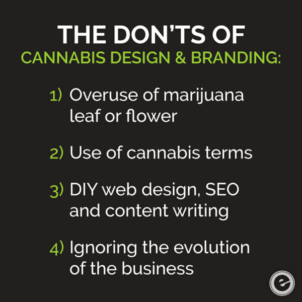
Many existing dispensary shops and ancillary weed-based businesses use the obvious indicator of the product, the marijuana leaf. But according to a recent U.S. Patent and Trademark Office report, 44 percent of logos in this industry had some form of the plant included. Isn’t the cannabis industry much bigger than that?
Think of it this way. If you had a company that manufactured a coffee drink flavored with butter (some people drink coffee as such), how impactful would coffee beans or a stick of butter be to the logo? Pretty meh, right? And it wouldn’t pass the three second test. That is, if a consumer even needed the entire three seconds before passing it over and looking for “Next”…
The Right Look and Feel of Cannabis Branding Makes Consumers Want to Touch It
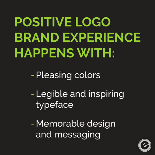
Strong branding and alluring cannabis design are one in the same. Brand colors and placement, typeface, size and tone all play a significant role in how a consumer perceives who you are, what you do and how you do it. This is inclusive of marijuana enterprises as well. It boils down to creating the experience that a person wants to visit and revisit.
More than likely, the first customer experience happens on a website. Unless it’s a landing page, the home page is the starting point. From there, people will then venture into the brick and mortar of the company, the dispensary, for example. But what then?
The Journey of the Marijuana Brand Experience
Let’s say you’re driving home from work on a Friday evening and although you’ve put the work week behind, you’re still carrying the stress of the job (as many of us do). While you’re approaching a stop light as dusk begins its descent, something catches the corner of your eye. There, at the top right corner of it.
There’s a billboard, extolling the virtues of a marijuana dispensary located just around the corner. You’re a card-carrying member of the cannabis community so you follow the sign to check it out. You’re thinking that, more than likely, they’ll have something to help ease the tension from your neck and back. And they’re just two miles from home. Timing is everything. But here’s what I haven’t told you yet: the company’s name, Kind Meds. Emotionally approachable? Heck yeah!
One more anecdote before we move on … If your web brand doesn’t align with your on-site experience, you’ve created a consumer disconnect. For businesses that rely on marijuana marketing to increase brand awareness, engage new customers and build brand loyalty, it’s everything.
Let’s take this up a notch.
Tomorrow’s Marijuana Advocates Might Be Today’s Adversaries
What if the person in that car heading home from work wasn’t a marijuana advocate? In fact, what if he/she is one of the millions in the United States who still support the Schedule I drug classification? Even with the recent news that the DEA moved some marijuana formulations into Schedule V, making this the first time it provided a sliver of government-backed legitimacy to its use, it isn’t widely known to the general public.
Even with the anti-cannabis tide changing, leaning more towards acceptance, how could a brand convince a person, dead-set against the product, to give it a moment (three seconds) of consideration?
If you’re trying to get the attention of consumers who are on the fence about cannabis use, reminding them about past stigmas and conflicting legal regulations (state-to-state and federal) won’t do your brand any favors.
Instead, make sure your cannabis design and overall brand sell an experience or a lifestyle. There are effective ways to execute this, as there’s no reason to state the obvious by using a marijuana leaf. It’s boring, dated and represents lackluster creativity. Besides, you cannot “sell” product through cannabis advertising any way.
What you can do is create cannabis design that excites the senses and exudes a direct representation of the company and the corresponding audience(s) you’re wanting to attract.
It’s All About the Packaging
Recent stories and concerns across the country are forcing necessary changes in the way cannabis products are packaged. Some states are instituting new guidelines in marijuana products that not only minimize the allure of edibles to children, but make it more difficult to open the products (child-resistant and child-proof).
Brand Persuasion in a Name
Meanwhile, let’s get back to the potential new cannabis lover, yet to try the product. Normally, a billboard that had a hint of marijuana theme to it would never get a second chance. But there’s something about the name Kind Meds. It’s warm, inviting and supportive. What if the entire brand experience echoed the same description?
This is powerful brand positioning. It creates, through suggestion and statement, what the dispensary stands for and what they deliver to the consumer. No matter how the cannabis industry evolves (or stands still at some point), the term kind will always relay positivity and something to be shared. Perfect for social media campaigns.
Brand Differentiators Are Essential to Shine Beyond Competitors
Just like any other industry, cannabis businesses must use design and marketing to create memorable impressions on their customers and prospects. In today’s retail culture, it isn’t just enough to throw up a sign, open your doors and expect the sales traffic to flow.
Consumers want to do their research. They want to find verifiable sources that speak to the benefits of what you have to offer. And when they finally decide to come face to face in store, the research and testimonials have to match up to their experience. If it happens, they’ll buy that product and cannabis swag you have on the shelves, share their experience and be your brand ambassador. Then hit repeat.
How Do You Put Cannabis in Front of People? We Do This, Well.


