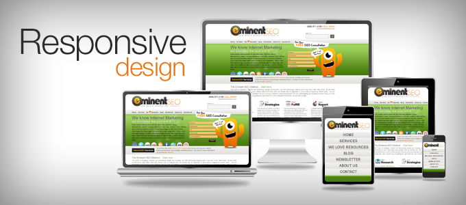
“Response design” – it’s a fancy term for a simple concept: making sure your website functions well across all major devices people use to browse the internet these days (smartphones, laptops, tablets, iPads and PCs).
In 2011, approximately 1.15 billion of all internet users browsed the web with a mobile device, which compares to the 1.3 billion that viewed the internet with a desktop computer. Fast forward that to 2014 projections, which have about 1.9 billion mobile internet users, compared to about 1.7 billion desktop internet users.
So, now you see from a high level why responsive design is no longer an option… it’s a MUST!
5 More Specific Reasons You Need a Responsive Website
Even though the market demands responsive design, there are many more reasons to develop one, including:
- Google demands it for good rankings – Hey, Google’s all about serving up the highest quality results for searchers. Part of quality means Google evaluates your mobile website design. Search Engine Journal, a leading online magazine on the latest search engine news, notes Google refers to responsive web design as its recommended mobile configuration and even industry best practice.
- Easier to manage SEO – The alternative to a responsive design is to create separate websites for separate device types. If you’re an adept business person, be aware that this requires 2 separate SEO campaigns. Why not condense both into 1 and cut your internet marketing efforts in half?
- It’s cost effective – Not only is responsive website development a good business practice from an SEO perspective, but it’s good from a design perspective too. Could you imagine how much it would cost to design a separate website for laptops, smartphones, and PCs, and then optimize and manage each for years to come?
- Makes life easy for searchers – Today’s instant gratification consumer won’t try to figure out how to best view your website. If you serve it up for any device they might view it on right away, they’re much more likely to stay around and subscribe to your website.
- It’s easy to find critical information – A desktop/laptop design, which has plenty of viewable space, makes it easy to find your contact information and to navigate around your website. But, if you only designed for a PC, then the design may not display as well for mobile users. If they have to exert additional effort figuring out how to contact you or use your website, how likely are they to eventually become paying customers?
Responsive is Quickly Becoming the Standard, so Why Not Act Now?
If you don’t already have a responsive design, it’s clear you’ll need one in the very near future. By acting now, you’ll save yourself a ton of headaches down the road.
Doesn’t that make good business sense?
Eminent SEO offers full Mobile and Responsive Website Design and Development services. Give us a call if you need help moving your site into 2013! (800) 871.4130


I hate when sites look weird on my phone
mobile will be the main way to search in a few years
That so true and we will probably be making mobile versions of a site first that respond to desk top browsers if all of our screens aren’t touchscreen in the next 5 years
It’s hard to figure out the mobile option on godaddy website tonight
That’s why you should get your website from EminentSEO lol
If everything can be responsive then why do we need apps?
Apps are created for mobile only – so typically they are built for websites/businesses that offer a unique function that would be better for the user experience if they were mobile only. Whereas the website might offer other information and functions that would be cumbersome to the user if the full site was available on a mobile device.
Nice blog! It’s an informative blog for all and thanks for sharing your ideas.
Thank you for reading and glad you enjoyed it! Feel free to check out some of our newer blog posts and let us know what you think. We put a lot of work and research into these!