Graphic design is always evolving. Every year new trends emerge and old fads become obsolete. We work online so we look at a lot of websites and, as designers ourselves, think it’s extremely important to know what is going on in the design world.
So, here are the 2019 graphic design trends recapped, 2020 design trends we love so far this year, fun examples of the changing face of design… and what you (still) have to look forward to in 2020!
2019 Design Trends Recapped
Design helps us understand our world. Trends place us in time.
The overarching design trend for 2019? Just like in every other part of life, it seems, we were in opposition with ourselves. Last year was all about contradictions. Design trends from conflicting eras and opposing ends of the visual spectrum all vied for our attention… So, who won?
Let’s recap what the graphic design world saw in 2019:
Early 2019 showed signs of oh-so-fresh color pallets. Maybe everyone was just over the holidays or just ready to mix up their feed a bit, but either way, January 2019 design brought us color trends, such as:
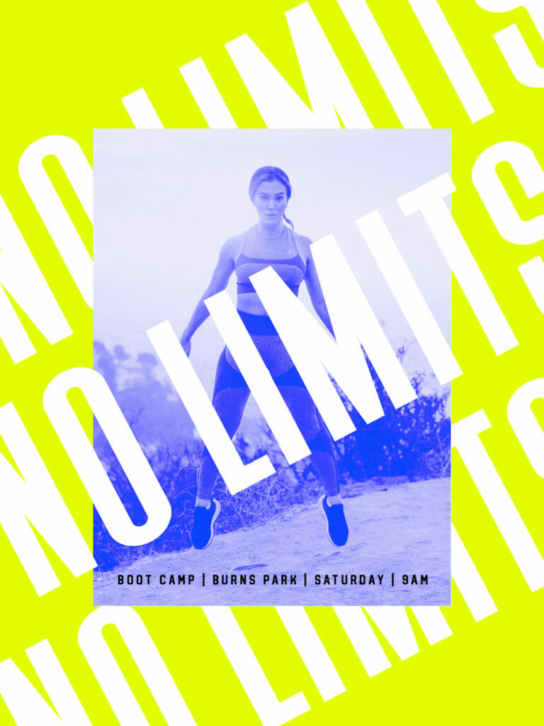
Vivid Color Combinations
In 2019 graphic designers used vivid colors to capture a user’s attention. You only have a split second to communicate a message in today’s busy marketplace. Color can help a designer grab the audience and create a lasting impression for the brand.
Design by Mohamed Samir
Pro Designer Tip: When using vivid colors in your design, make sure you clearly distinguish the differences between the items in the forefront and background so it’s easy to still read your message.
Dreamy Color Combinations
Vivid was taken from abstract to soft and dreamy with patterns inspired by liquid.
Liquids move and when they do, they create natural shapes, patterns and textures. This fluidity, combined with the trending futuristic colors, inspired graphic designers to make magical and dream-like art.
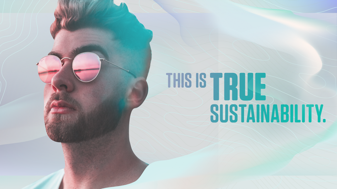
Design by Quickfish
See more examples of Dreamy Color Combinations by Visual Artist Magdiel Lopez on his Insagram account.
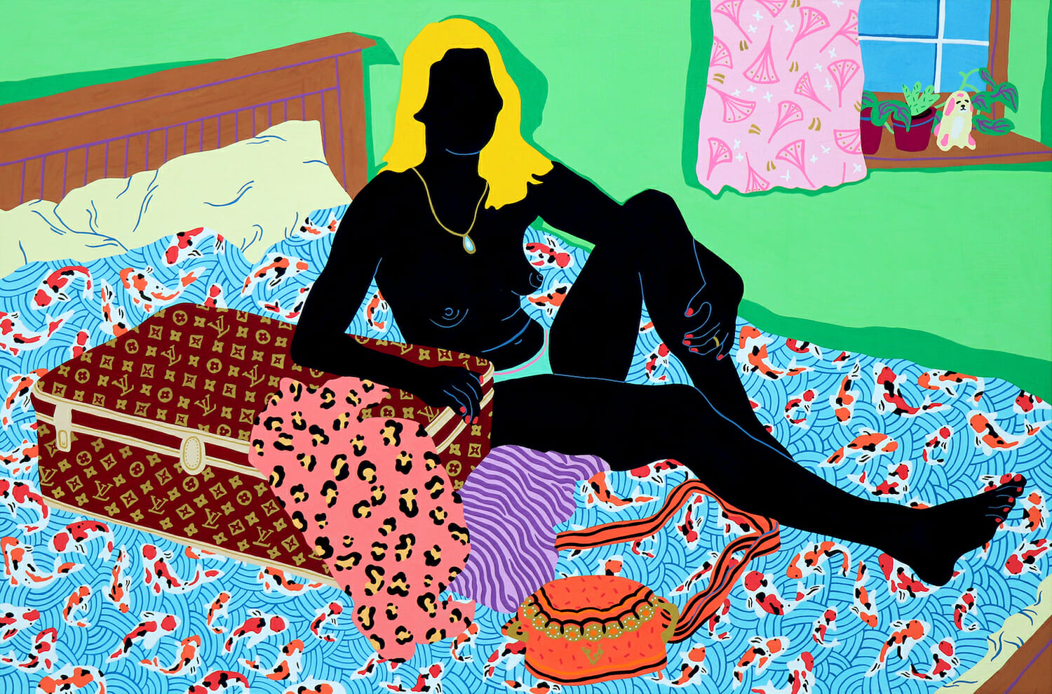
Designs with Human Illustrations
Sure, stock photos are cool but have you used humanistic illustrations? 2019 brought us illustrated people and we are already well into 2020 and still seeing this design trending hard, especially in software and technical websites.
Even Eminent SEO embraced this trend with our own blog posts and social media:
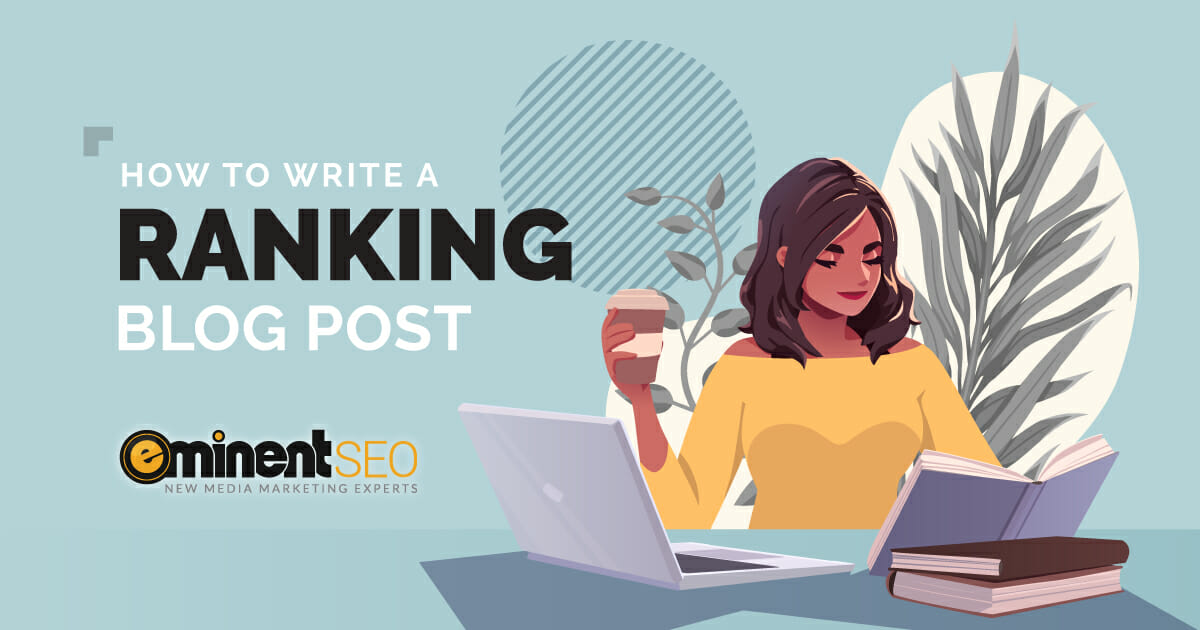
Image source: https://www.eminentseo.com/blog/how-to-write-a-popular-ranking-blog-post/
Let’s face it, we’ve all seen enough cheesy stock photos to last a lifetime. Humanistic illustrations are an easy way to add a visual element to your content without having to use, well, real people.
Sticker Trend
Possibly one of the cutest trends of 2019, Instagram stickers brought so much YES! to the graphic design world. How do they work? Basically, you create a graphic that looks like a sticker and slap it on any image for a seriously fun and easy way to make your brand stand out!
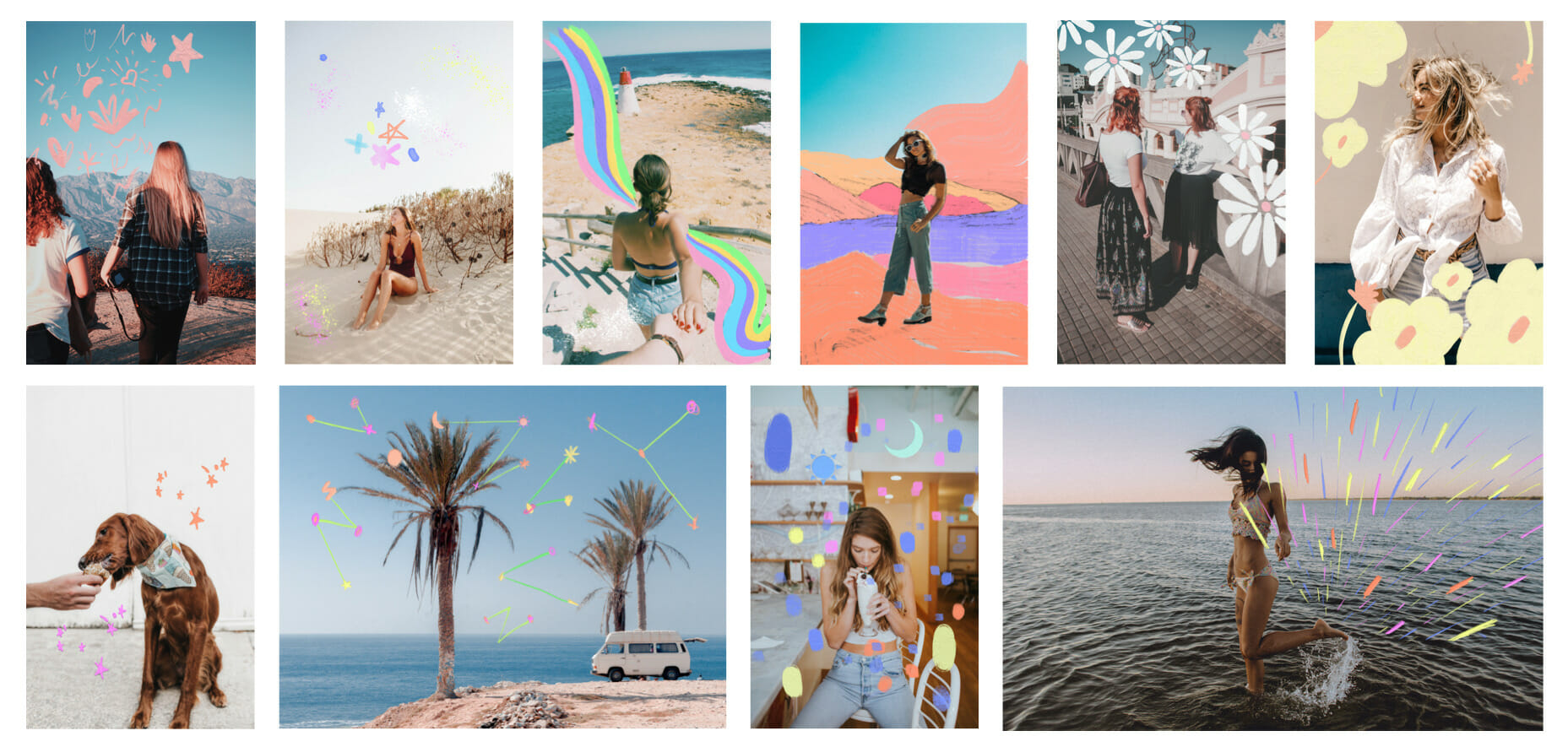
Image source: https://later.com/blog/instagram-overlay-stickers/
The 2019 Sticker Trend is still super cute! In this post, you’ll learn how to create your own Instagram overlay stickers, discover creative examples from influencers and brands, and find out how to successfully incorporate stickers into your feed: https://later.com/blog/instagram-overlay-stickers/
Contrasting Textures
Who doesn’t love a smooth surface or a shiny object? Texturing provides the surface of a design a specific look and feel, giving personality and bringing the design to life. Textures give depth to backgrounds and visual intrigue for the user.
You can use a texture to actually highlight a specific aspect of your design personality. For example, if your brand is sustainable and about saving the planet, think organic and natural colors and textures.
Without texture, life would seem pretty flat. And the same goes for your designs. Learn how to turn heads with textures with Over.
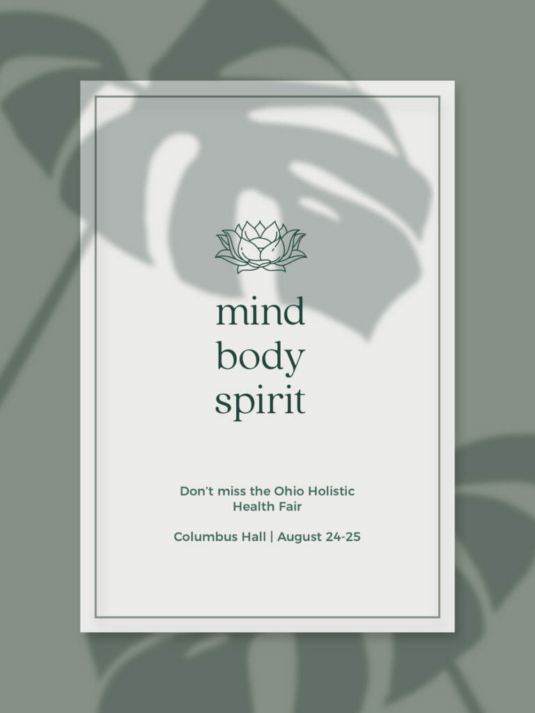
Botanical and Leafy Shades
One of my personal favorites. This trend speaks to my softer, more feminine and romantic side. Something about using plants to create an aesthetic really speaks to my soul. However, this leafy shade trend took the whole thing to a new level!
I’m talking about plant shadows!
We saw these beautifully integrated into social posts, ads, flyers and blog banners. Did you use this trend last year?
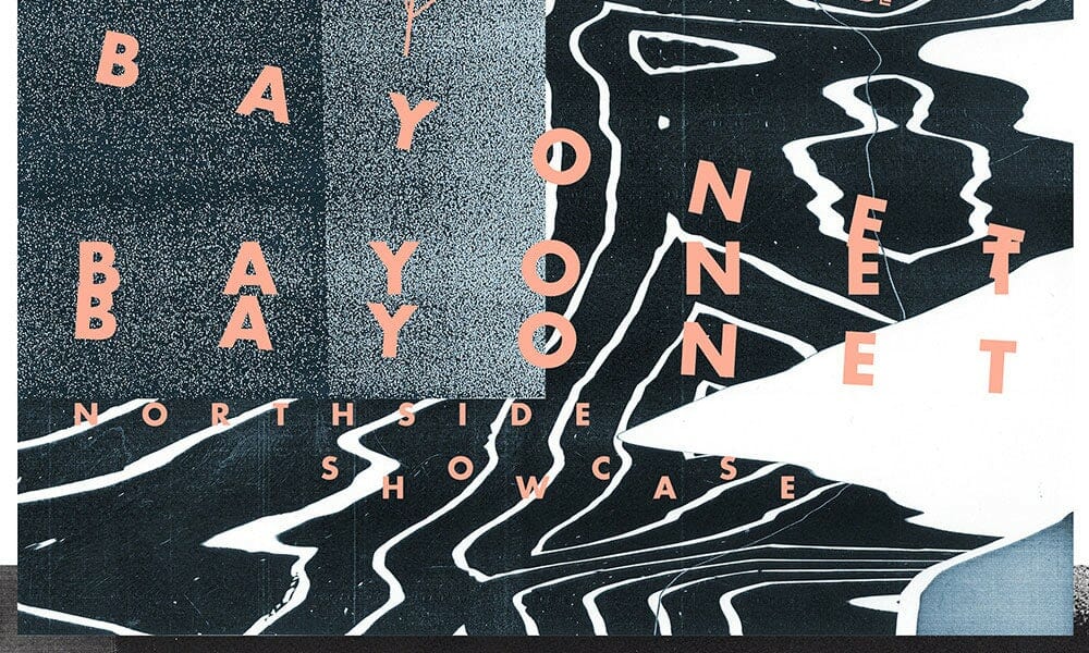
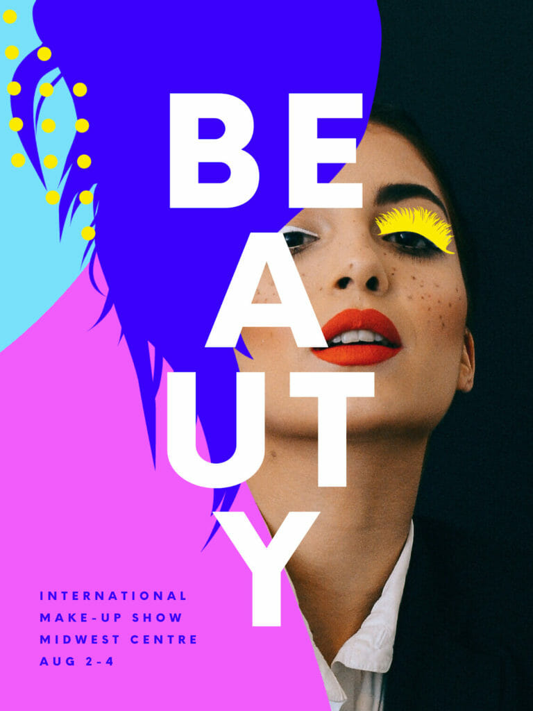
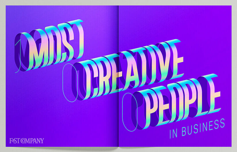
Bold and Creative Text Posters
Short but BIG and BOLD typography, creatively positioned, was a big trend in poster design for 2019 graphic artists. With text playing the role of the illustrated art, designers had fun breaking up words, scattering and rotating letters and even extending giant text beyond the borders.
Posters weren’t the only products getting bold typography. Packaging, social media posts and merchandise are all perfect for this fun design trend.
This example uses the 2019 sticker trend as well. Loving it.
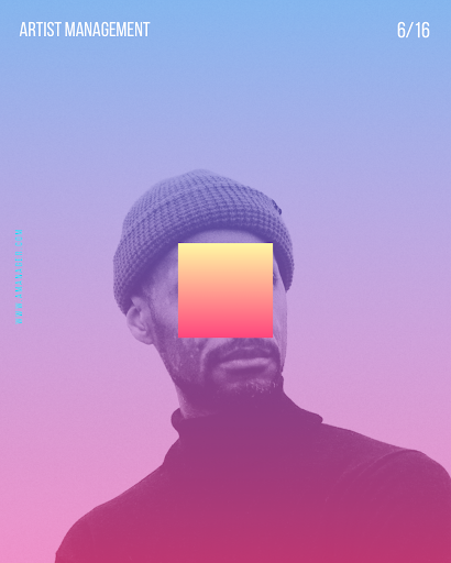
Synth Futurism
What is Synth Futurism? Don’t worry, we didn’t know either, so we looked it up for you, and it’s basically a throwback to the dawn of the digital age when people imagined what the future would look and sound like. It’s all about glowing neon, geometric shapes, colorful duo-tone gradients, grid landscapes and other abstract or unexpected elements.
This trend brought out the rule-breakers. Just place that square anywhere, you brave little designer you!
If you’re looking for a design trend that’s achingly cool and gets eyes on your brand, Synth Futurism could be just the thing.
I totally see this as an album cover or for a social series that promotes a CBD brand or something. Maybe both.
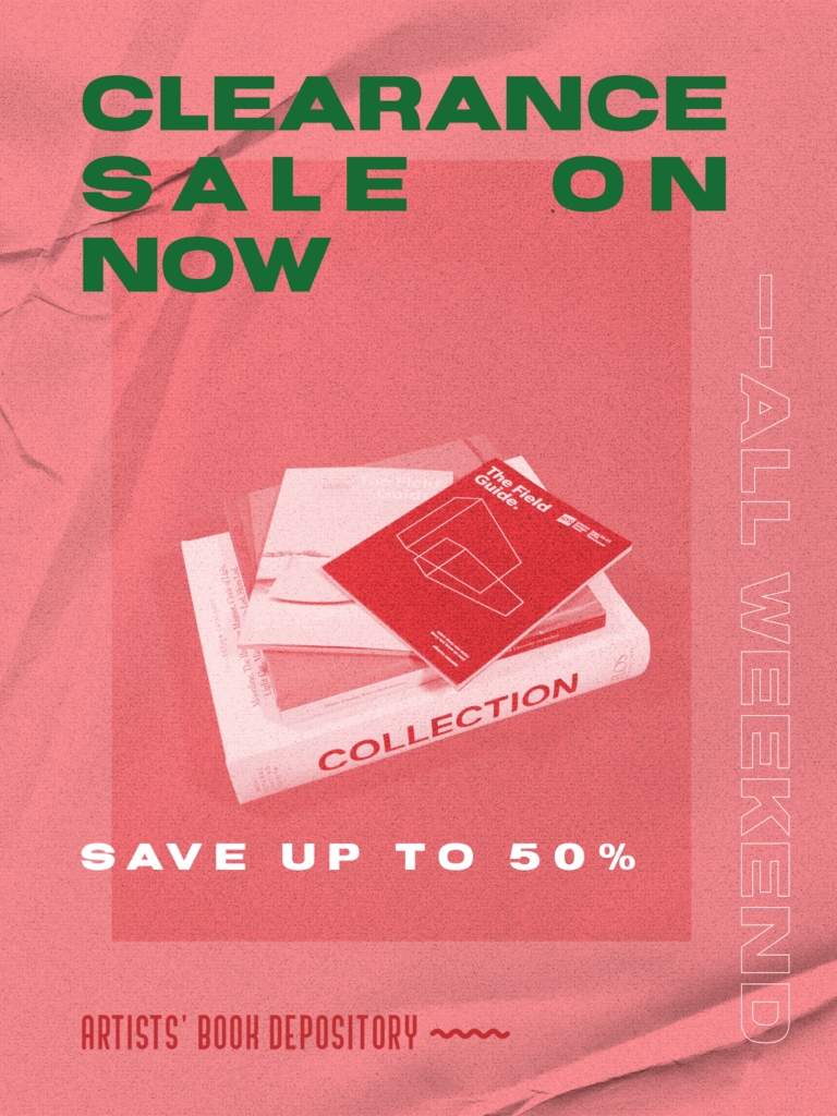
Brutalism
Another design trend for the rulebreakers (let’s be honest, us artists are really all rulebreakers), Brutalism was seen a lot in 2019 urban fashion brand marketing campaigns and used for ads and event posters.
Brutalism is not for everyone. But for those that wanted something a little more punky or edgy, the clash of colors and stark, sort of analog style that brutalism brings seemed to really hit a note with designers in 2019.
And, Finally the 2019 Color of the Year: Living Coral
The 2019 Pantone Color of the year was 16-1546 Living Coral. The message was clear. The ocean is dying. It was pink… but now? Well, whatever color it is now, it’s not alive. So, they named their color “Living”. I think that’s pretty powerful. There is a deeper message here. I like that.
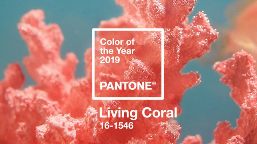
Image source: https://www.adweek.com/brand-marketing/living-coral-is-pantones-2019-color-of-the-year/
“Vibrant, yet mellow PANTONE 16-1546 Living Coral embraces us with warmth and nourishment to provide comfort and buoyancy in our continually shifting environment.
In reaction to the onslaught of digital technology and social media increasingly embedding into daily life, we are seeking authentic and immersive experiences that enable connection and intimacy. Sociable and spirited, the engaging nature of PANTONE 16-1546 Living Coral welcomes and encourages lighthearted activity. Symbolizing our innate need for optimism and joyful pursuits, PANTONE 16-1546 Living Coral embodies our desire for playful expression.
Representing the fusion of modern life, PANTONE Living Coral is a nurturing color that appears in our natural surroundings and at the same time, displays a lively presence within social media.”
The 2020 Pantone Color of the Year
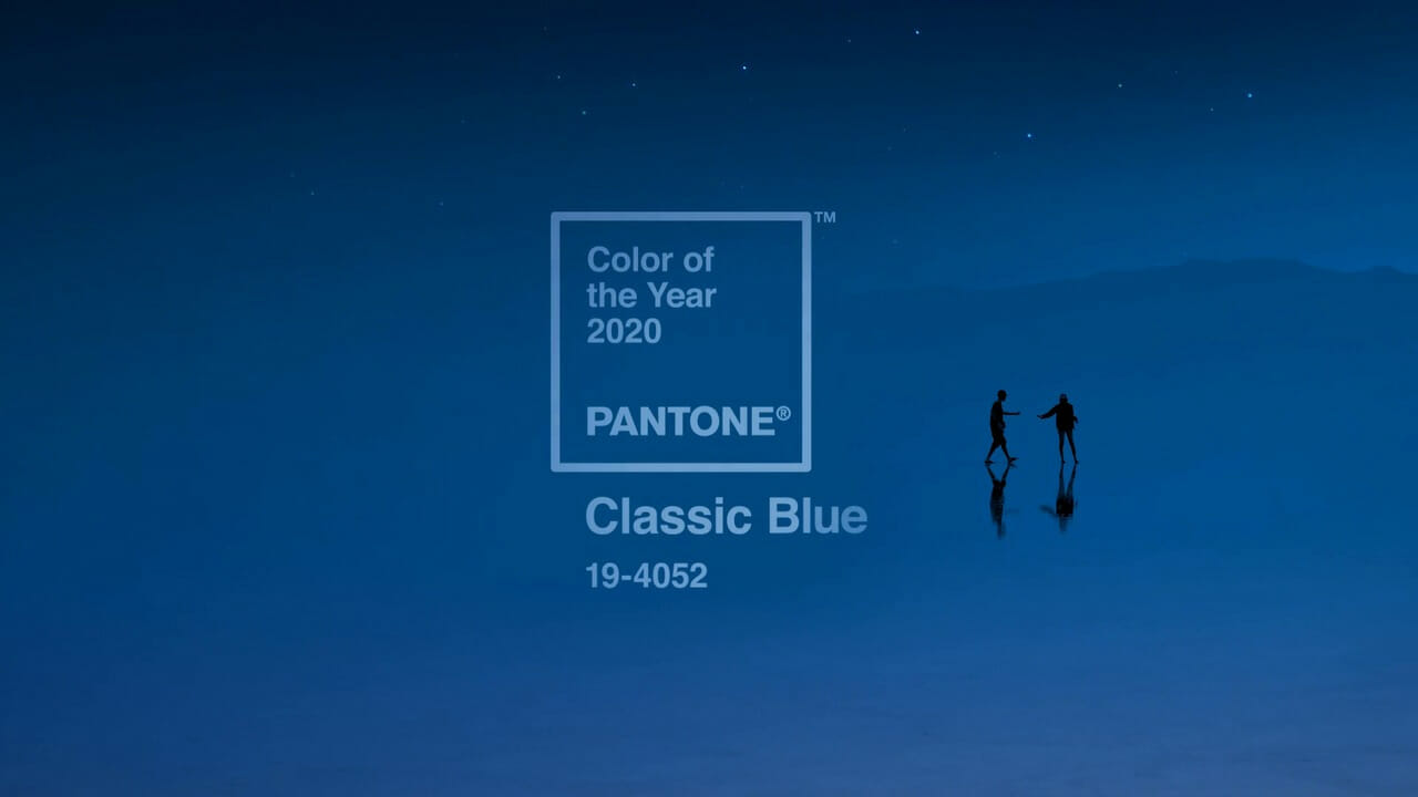
Image source: https://www.pantone.com/color-intelligence/color-of-the-year/color-of-the-year-2020
The 2020 Pantone color of the year is classic blue.
PANTONE 19-4052 Classic Blue
“A timeless and enduring blue hue, PANTONE 19-4052 Classic Blue is elegant in its simplicity. Suggestive of the sky at dusk, the reassuring qualities of the thought-provoking PANTONE 19-4052 Classic Blue highlight our desire for a dependable and stable foundation on which to build as we cross the threshold into a new era.
Imprinted in our psyches as a restful color, PANTONE 19-4052 Classic Blue brings a sense of peace and tranquility to the human spirit, offering refuge. Aiding concentration and bringing laser like clarity, PANTONE 19-4052 Classic Blue re-centers our thoughts. A reflective blue tone, Classic Blue fosters resilience.”
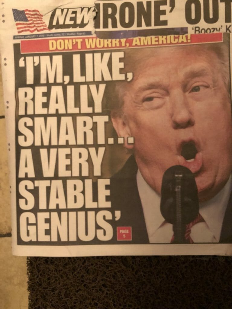
Am I the only one that sees the correlation with their choice to go with classic blue, the color of the Democratic party the same year that President Trump, a Republican, is up for reelection? I mean, even the words they use to describe why they chose it: “our desire for a dependable and stable foundation”.
And, then, this next part too: “Classic Blue brings a sense of peace and tranquility to the human spirit, offering refuge.”
Human spirit.
Refuge.
Anyone else think Pantone might be hinting at something here?
Just me? I digress…
What to Look forward to in Graphic Design in 2020
Now that we’re well into 2020, we can start to see some trends emerging for the year. Between the looming presidential election and the worldwide lock-down from COVID-19, there’s a strange but exciting feeling in the air, like anything can happen…
Let’s take a look at the graphic design trends of 2020 so far:
Handmade Humanism
From ripped edges to handwritten lettering, designers who want to incorporate a more organic touch have started making art with a more handcrafted feeling. This style is simple, yet emotionally compelling. The DIY-influenced aspects to this design make it feel more approachable for a fun and fresh way to present a brand or artist.
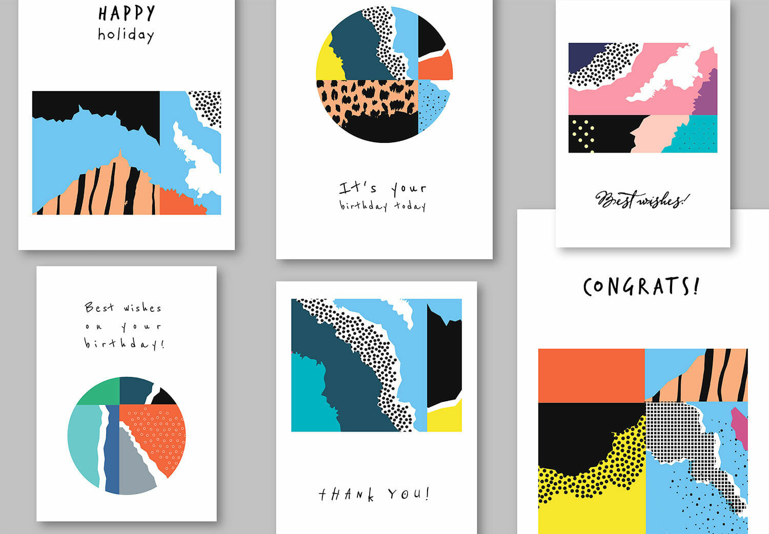
Image source: Lera / Adobe Stock
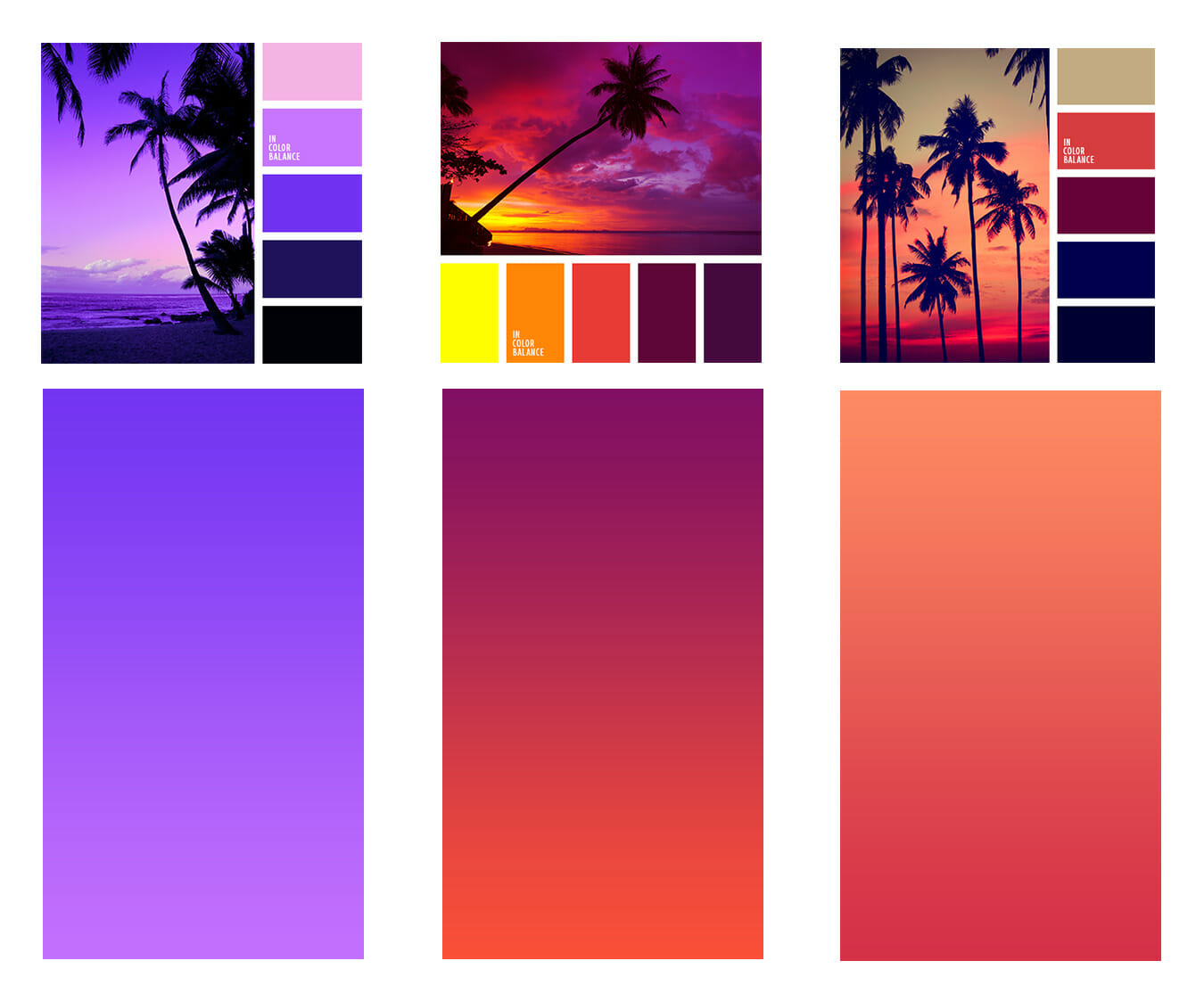
Color Gradients
Can’t stop, won’t stop.
This is what graphic designers are saying about this design trend for the third year in a row. The design world agrees: gradients are here to stay.
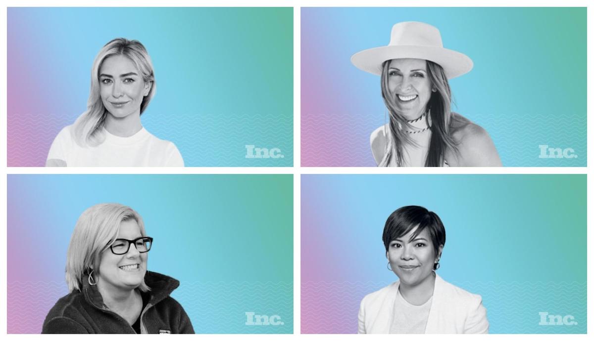
One common use is the use of colorful gradients as a background for your website images, like in this example from Inc.com:
Gradients are incredibly versatile and a great way to add depth to a blog, social or email design. Some graphic design websites are indicating there is a shift in 2020 from bold to softer colors. However, it does look like either way color gradients are here to stay.
Abstract & Dreamy Illustrations
You’ve probably noticed that illistrations have made it into mainstream design over the last few years. Where you used to see mainly unedited stock photos in many graphic designs you now find fun, cartoony feeling illustrated art.
The trend of abstract or dreamy illustrations exaggerates the concept by pushing the boundary even further by using unrealistic proportions, placement or color. This can be a great way to engage the user by giving them something visually interesting to break up long-form content.
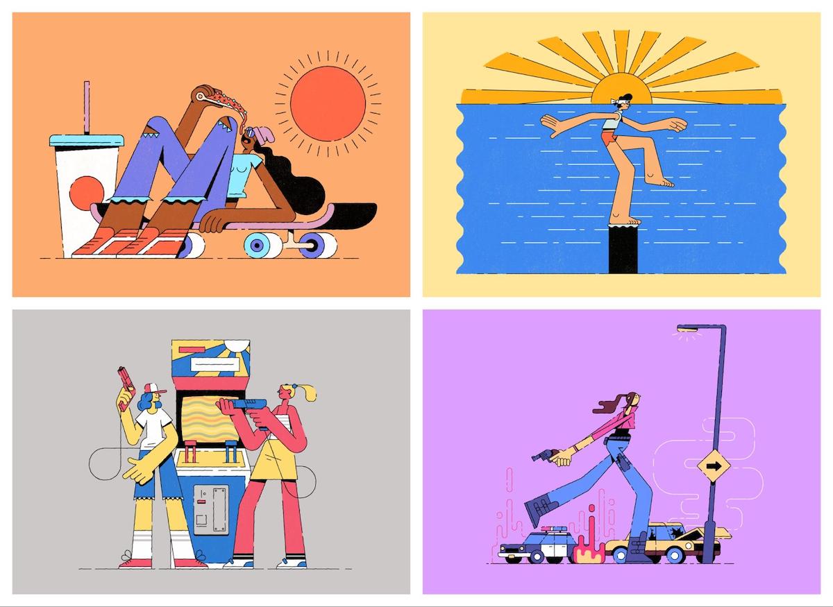
Image source: https://www.behance.net/gallery/75516539/2019-Illustration-Vibes
There are a lot of ways to combine design trends to make a truly unique piece of art. How cool is this illustration by artist Guille Manchado?
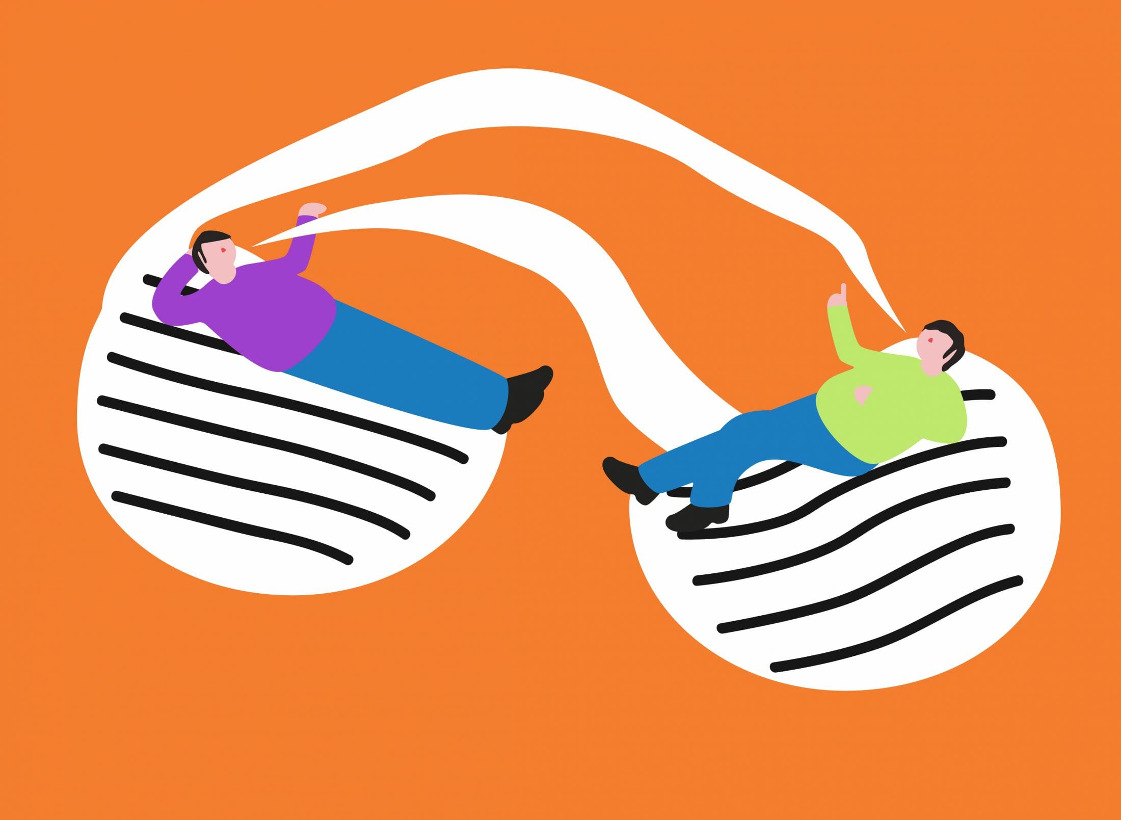
Image source: https://www.creativeboom.com/inspiration/a-look-into-guille-manchados-abstract-illustrations-/
Focusing on conceptual illustration, his work is dominated by an abundance of abstract and anonymous characters, each in his unique style of round shapes with a minimal color palette. Searching for a contrast between the complexity of meanings and the simplicity of aesthetics, Guille believes illustration is a way to solve problems and make people reflect and think.
Who doesn’t want their art to do that?
Heavy & Simple Fonts
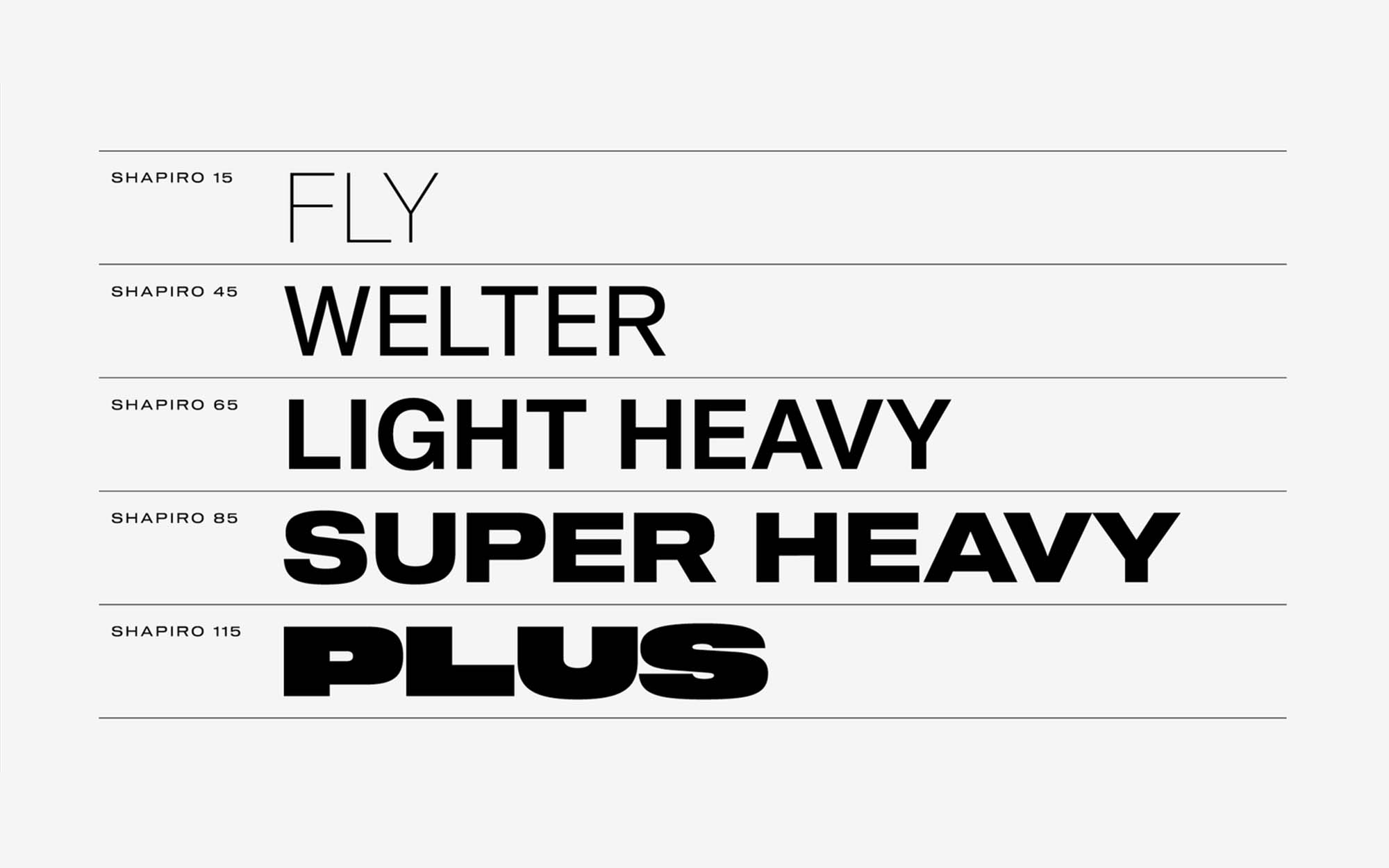
Typography has taken on a more minimalist and handwritten quality over the last few years. However, more recently you can see big brands and design agencies are moving towards bolder font choices.
2020 has already shown more ads featuring a font with a heavier weight. We’ve also noticed that designers tend to favor typography that allows a lot of contrast. One font can have several weight classes. By choosing to use a font with multiple weights a designer has more flexibility within their designs, while still staying on brand.
When I think of simple and bold, I think of MailChimp. I always thought their design was forward thinking. They are a great example of a big font as the focal point for their design.
Updated Art Deco
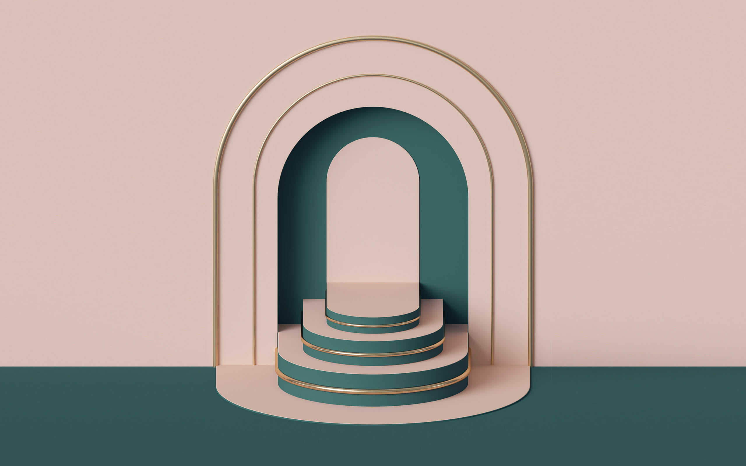
Graphic design has often pulled from building and architecture design. However, it wasn’t until the end of 2019 we started noticing art deco in more and more graphic art, particularly in eCommerce and product shots.
If you aren’t familiar with the style already, art deco is the predominant decorative art style of the 1920’s and 1930’s, characterized by precise and boldly delineated geometric shapes and strong colors and used most notably in household objects and in architecture.
From simple to seriously intricate detail, the art deco trend seems to incorporate geometric patterns, metallic elements, sleek typography and add an elegance that helps elevate brands.
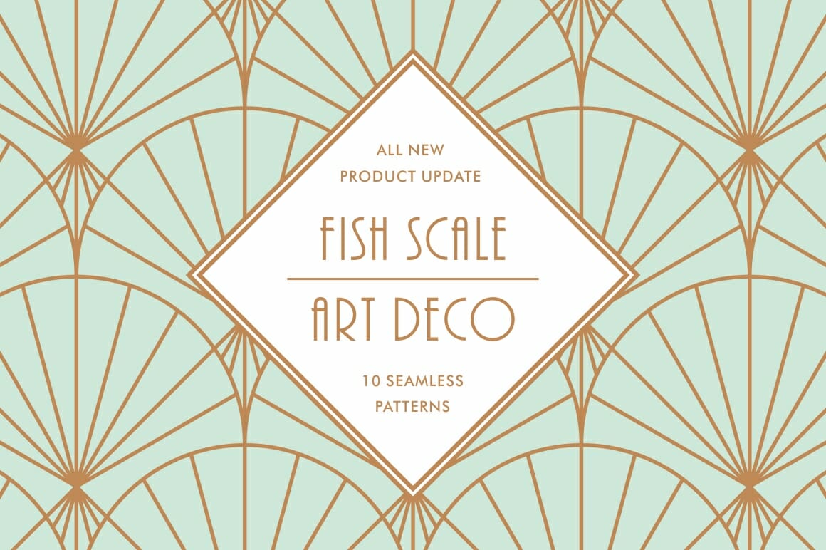
Image source: https://www.designcuts.com/product/fish-scale-art-deco-patterns/
Semi-Surreal
Another dreamy and artistic design trend we’re excited about: semi-surreal.
What does that mean?
Surrealism is a bizarre mix of elements, often jarring and seemingly nonsensical. Images can be surreal, like the melting clocks in Salvador Dali’s paintings, but can also be represented in strange, dream-like moments from everyday life.
Every artists dream, right?
Would love to see more of this trend in 2020.
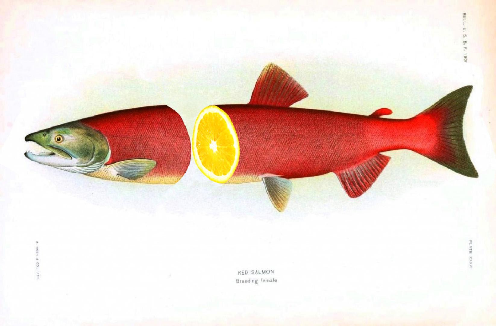
Image source: https://www.skillshare.com/classes/Photoshop-for-Lunch™-Surreal-Collage-Effect-Paths-Cloning-Warp-Blend/1635326606
Branded Animations
Yes, GIF’s have been around for (what seems like) ever! But, a new design trend has emerged. Animation and motion graphics have become powerful tools for advertisers and creative marketers all over the globe. They’re now so much more than a funny GIF. in 2020 we are talking about everything from small movements seen represented in images on most of the popular social sites and apps to full scaled promo videos with custom motion graphics.
This example helps show the kind of personality and uniqueness that every business should produce for their own brand.
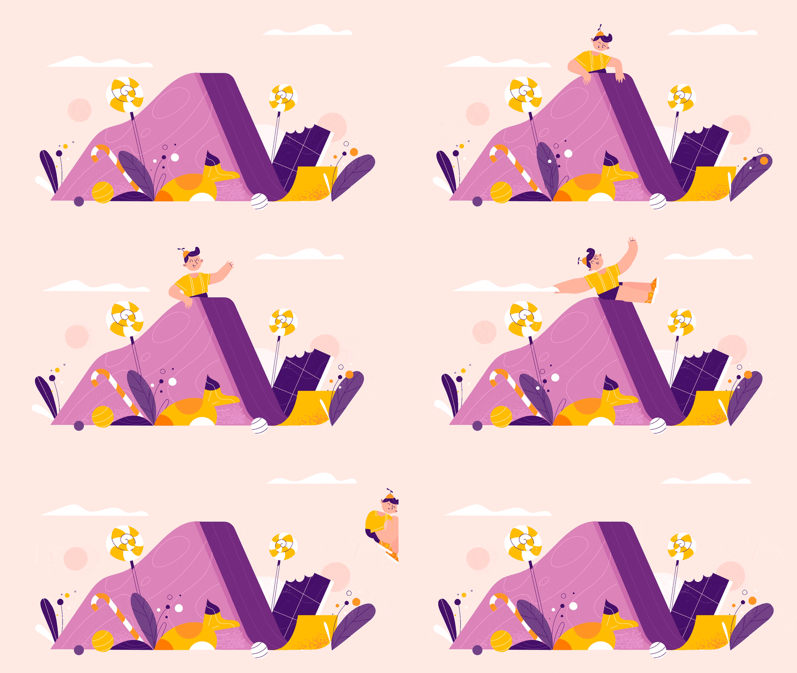
Image source: https://www.behance.net/gallery/79947869/Frisky-and-cheerful
I mean, how cute is this GIF?
For really talented graphic design teams, morphing is also gaining momentum in 2020. Morphing is when an image or an animation seamlessly morphs into another image or shape. The concept of morphing a logo, characters, brand images or other objects in a video is becoming a 2020 trend you don’t want to sleep on.
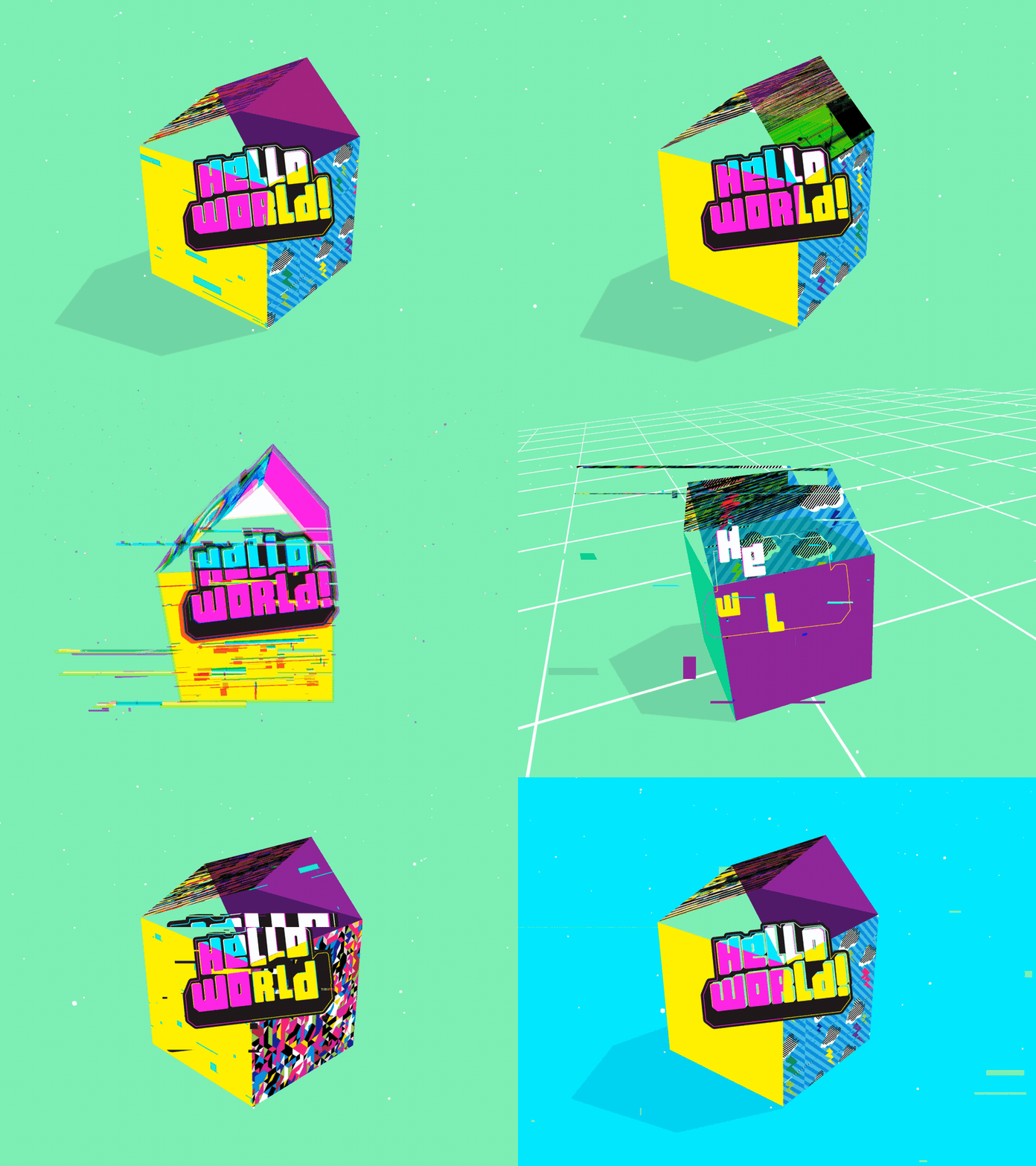
Image source: https://dribbble.com/shots/3947176-Hello-World
2020 Design Trends are Diverse
What might be most exciting about design in 2020 is how diverse the trends really are. There isn’t one specific type of art that seems to be dominating the graphic design world in 2020 so far.
We live in a digital world full of content and big sets of data. Graphic design helps make the internet a more visually interesting place. We predict 2020 will play an even bigger role on how facts, stats and data are represented online.
From abstract to surreal, we’re excited to see how far the design world pushes graphic art trends in 2020. What about you? What design trends are you hyped about this year? Share with us in the comments.
